ARCHIVE PROJECT
Sushi Club: branding
A knife, a chopstick and a maki roll in one mark.
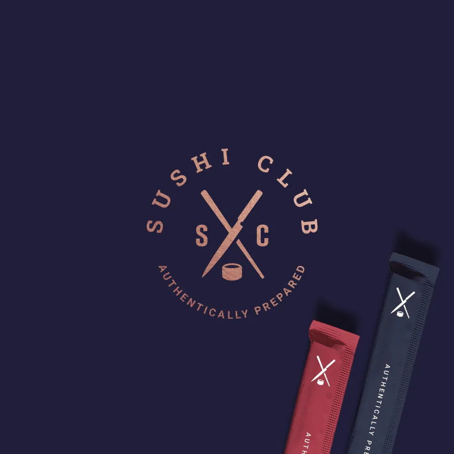
A logo and visual identity for Sushi Club, an authentic Japanese sushi restaurant in the US that starts out with home delivery.
CONTEXT
Sushi Club sets out to make authentic Japanese sushi accessible to American diners. The menu is maki, sashimi and nigiri with no more than three ingredients to a piece, so the fish comes first. The fish is fresh and cut with Japanese yanagi knives. The restaurant starts with home delivery and plans a dining room later. The aim is to give something new to people who have never had fresh fish, or know only Americanised sushi, while keeping the guests who come for the quality.
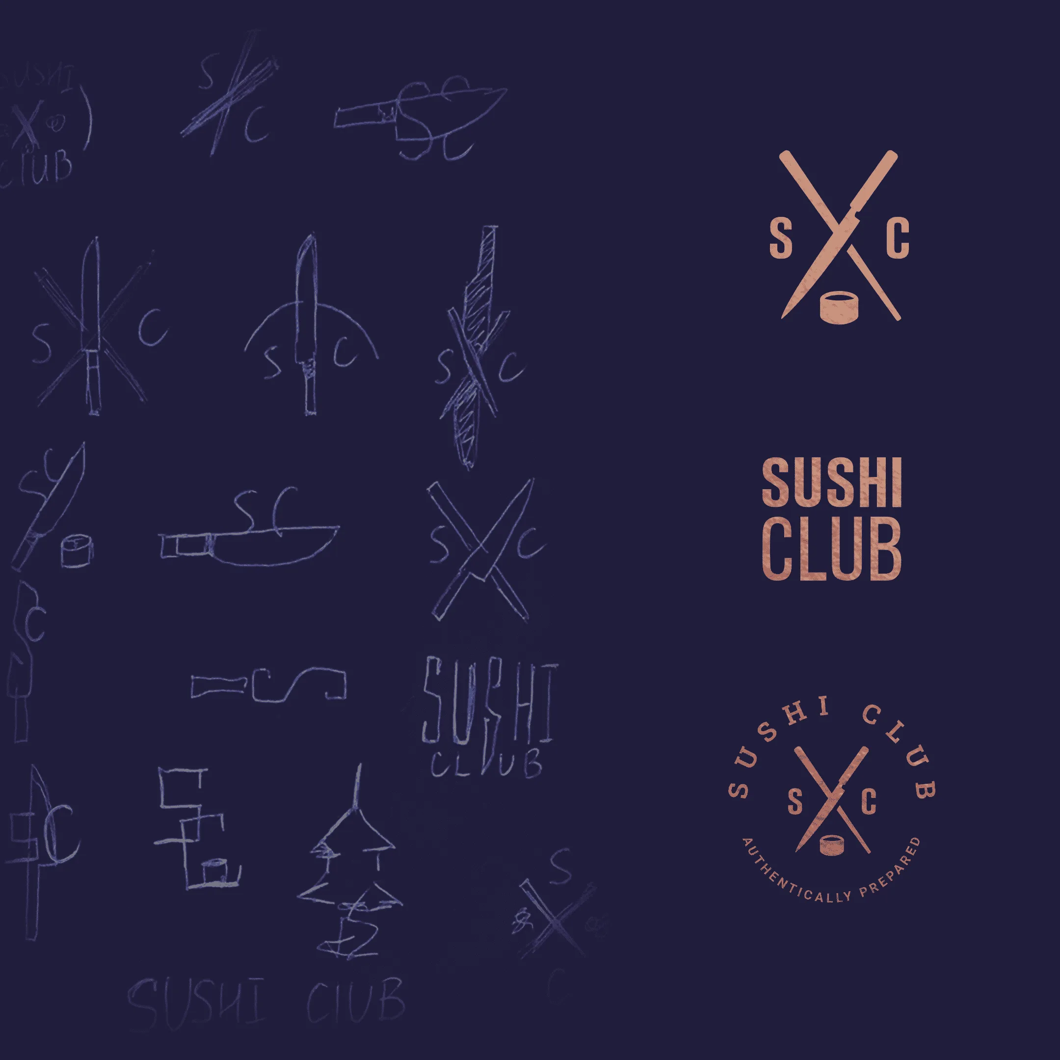
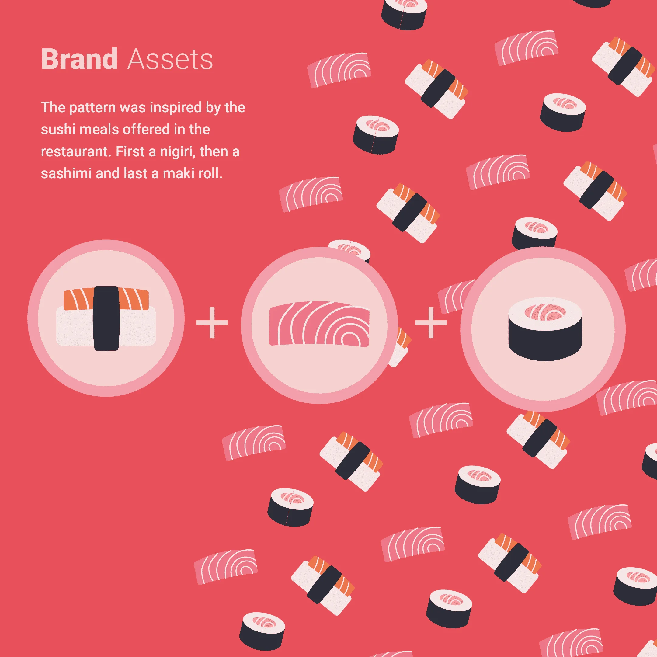
We start from sketches and arrive at a monogram: the letters S and C, a crossed knife and chopstick, and a maki roll beneath them. The mark works on its own, inside a round seal with the line “Authentically prepared”, and beside the name set on two lines. The palette runs from navy through coral, pale pink and orange to copper, and the brand pattern uses icons of nigiri, sashimi and maki, the dishes on the menu.
The identity is applied to:
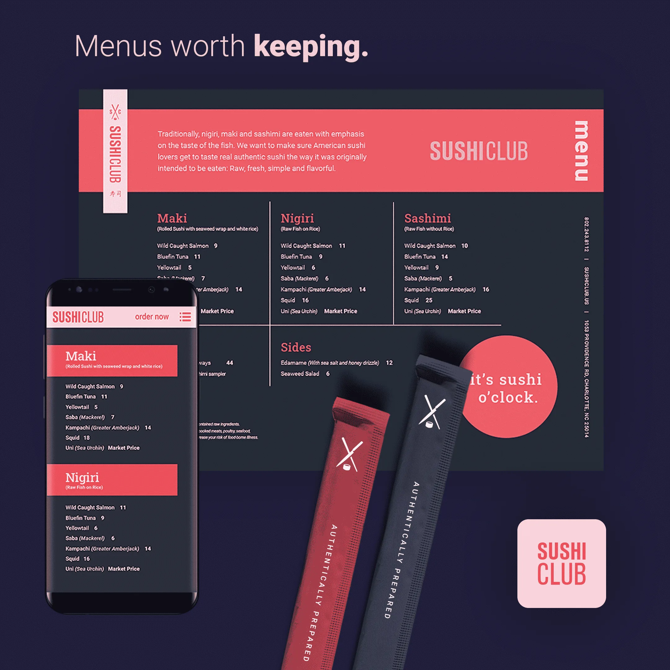
- the menu, in print and for phones;
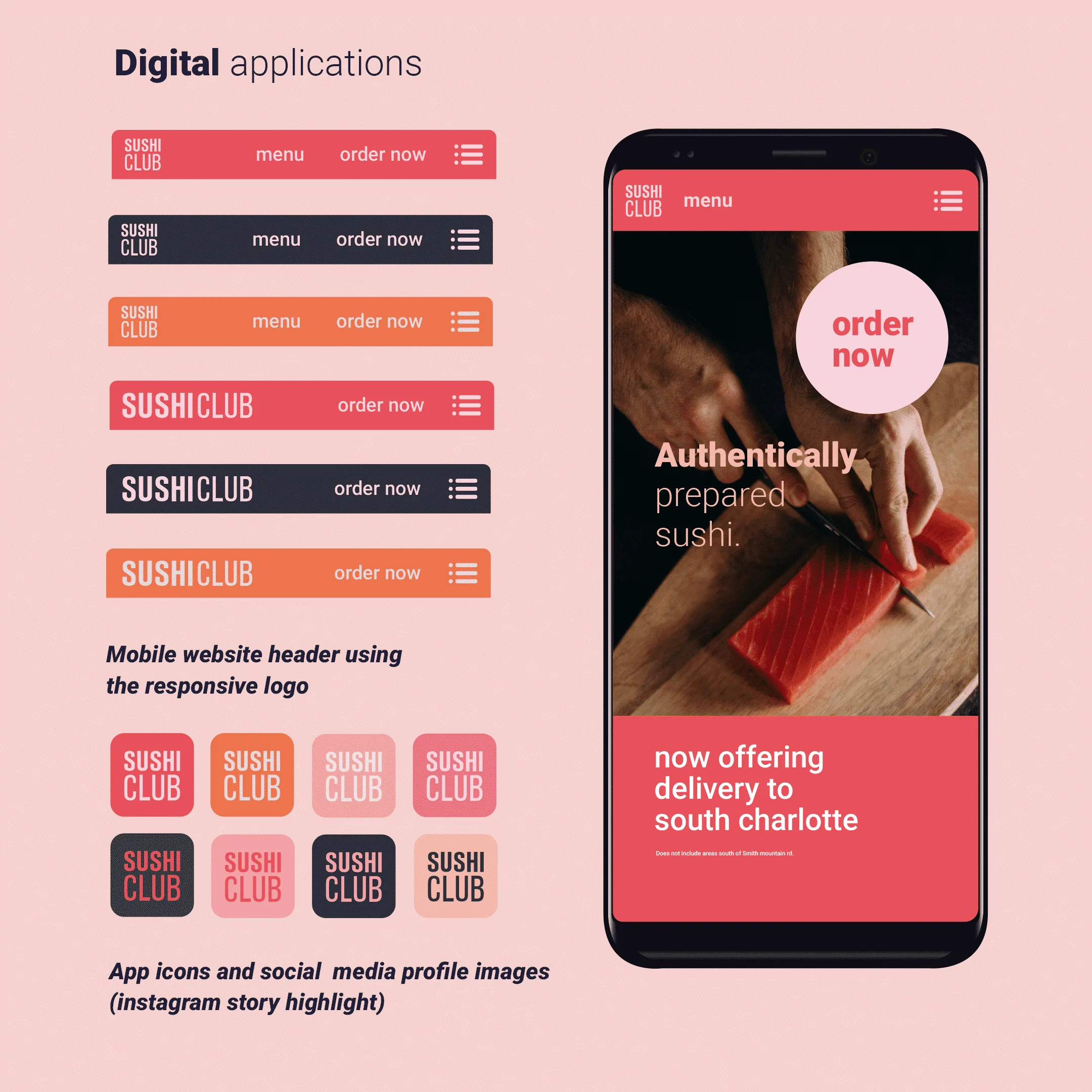
- the logo in a mobile site header, app icons and Instagram highlight covers;
- chopstick sleeves;
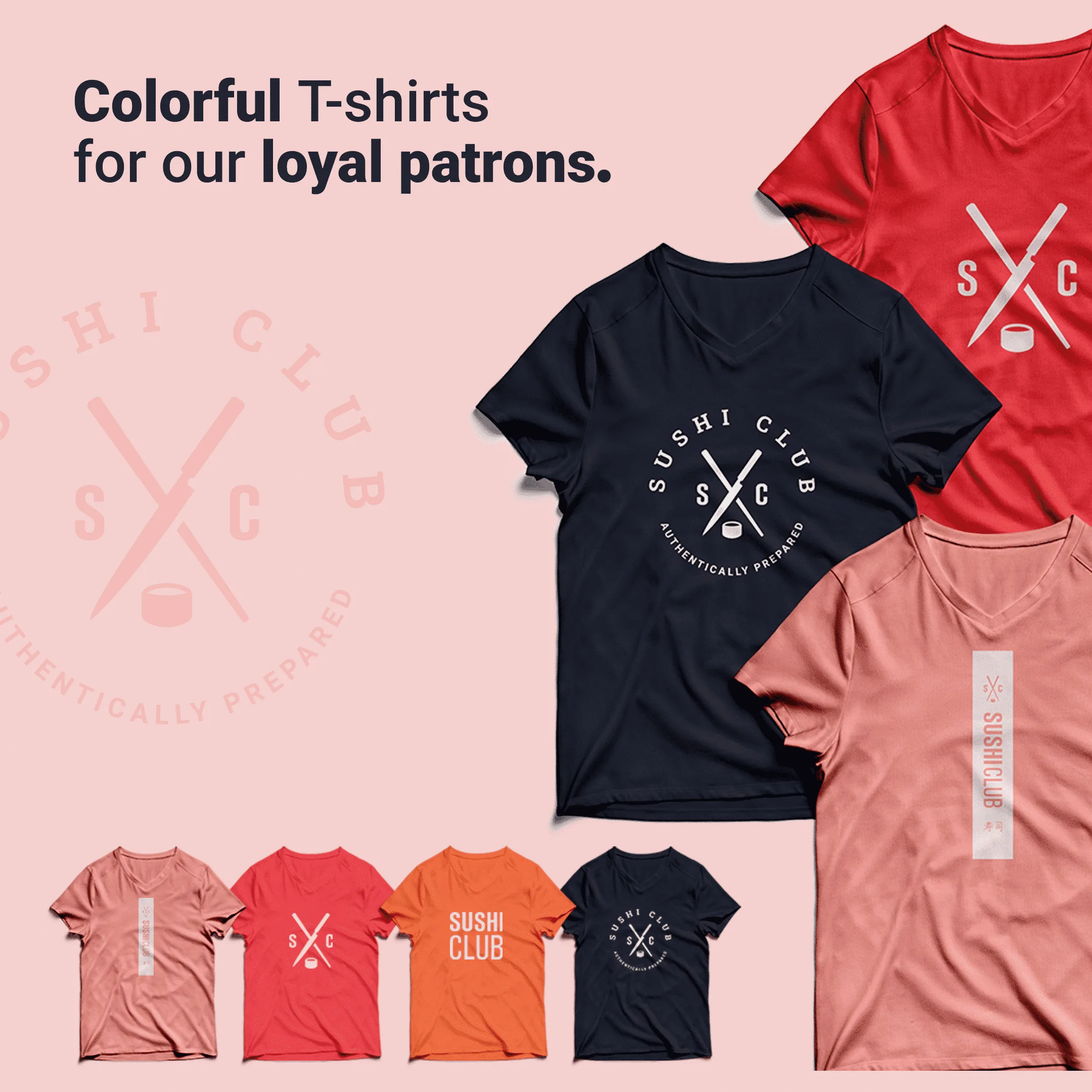
- T-shirts for regulars;
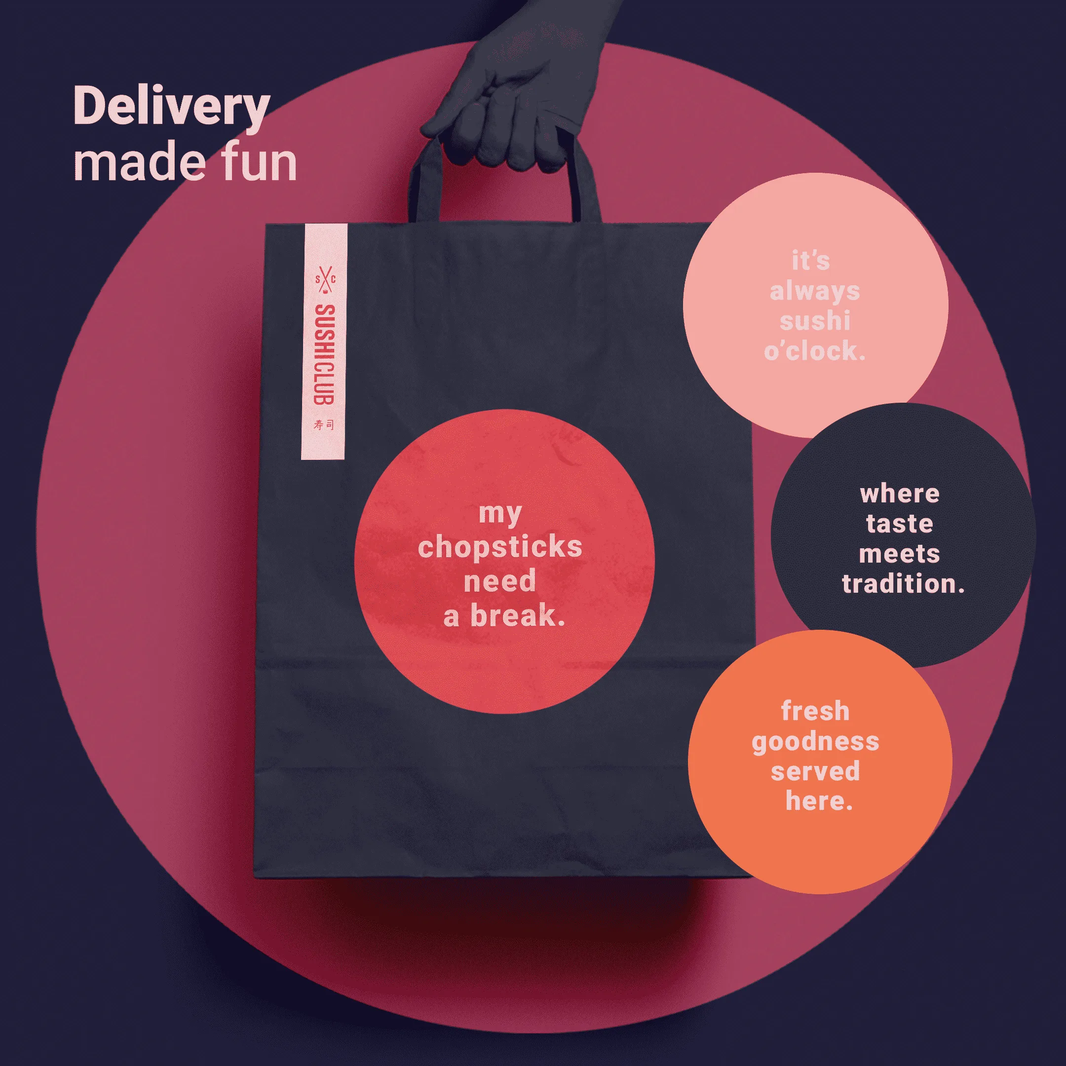
- a paper delivery bag with stickers carrying short brand lines such as “Where taste meets tradition”;
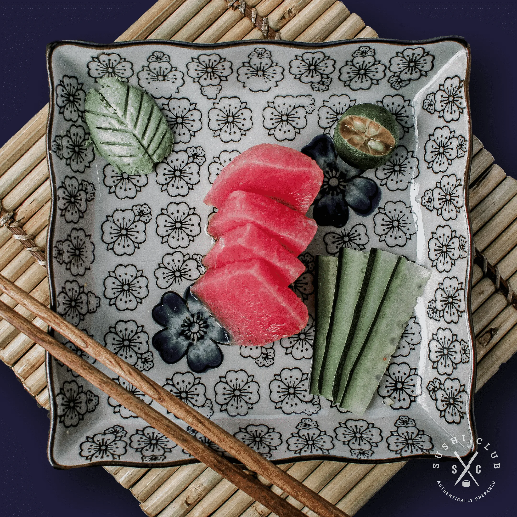
- photographs carrying the mark.
Gallery