ARCHIVE PROJECT
Raw: branding
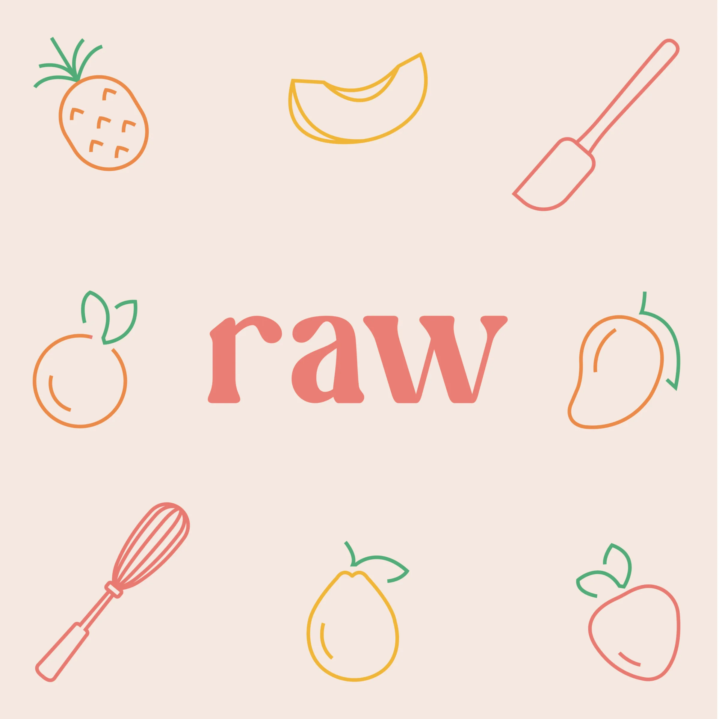
Lowercase letters, four fruit colours and line icons.
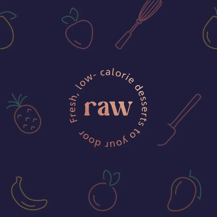
A name, a logo and a visual system for Raw, low-calorie desserts made from fresh ingredients and delivered to the door.
CONTEXT
The client makes low-calorie desserts from fresh ingredients, with no white or brown sugar and mostly fresh fruit, and delivers them to the door. The audience is women, and the brand has to feel exciting and modern. The brief covers the brand name, the logo and a consistent visual system.
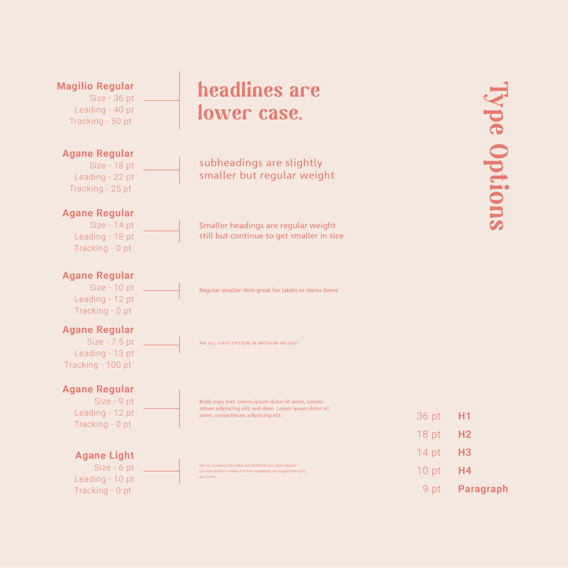
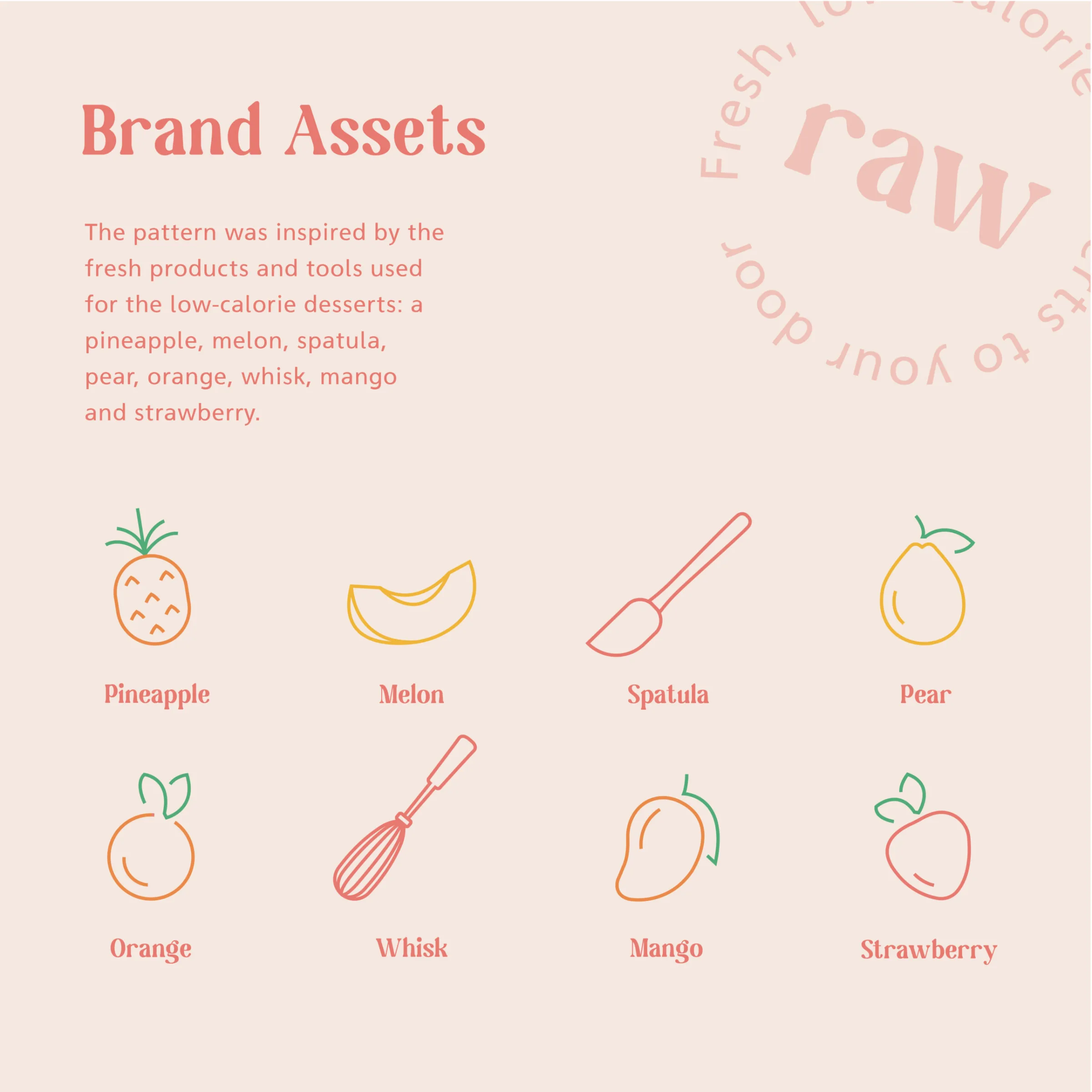
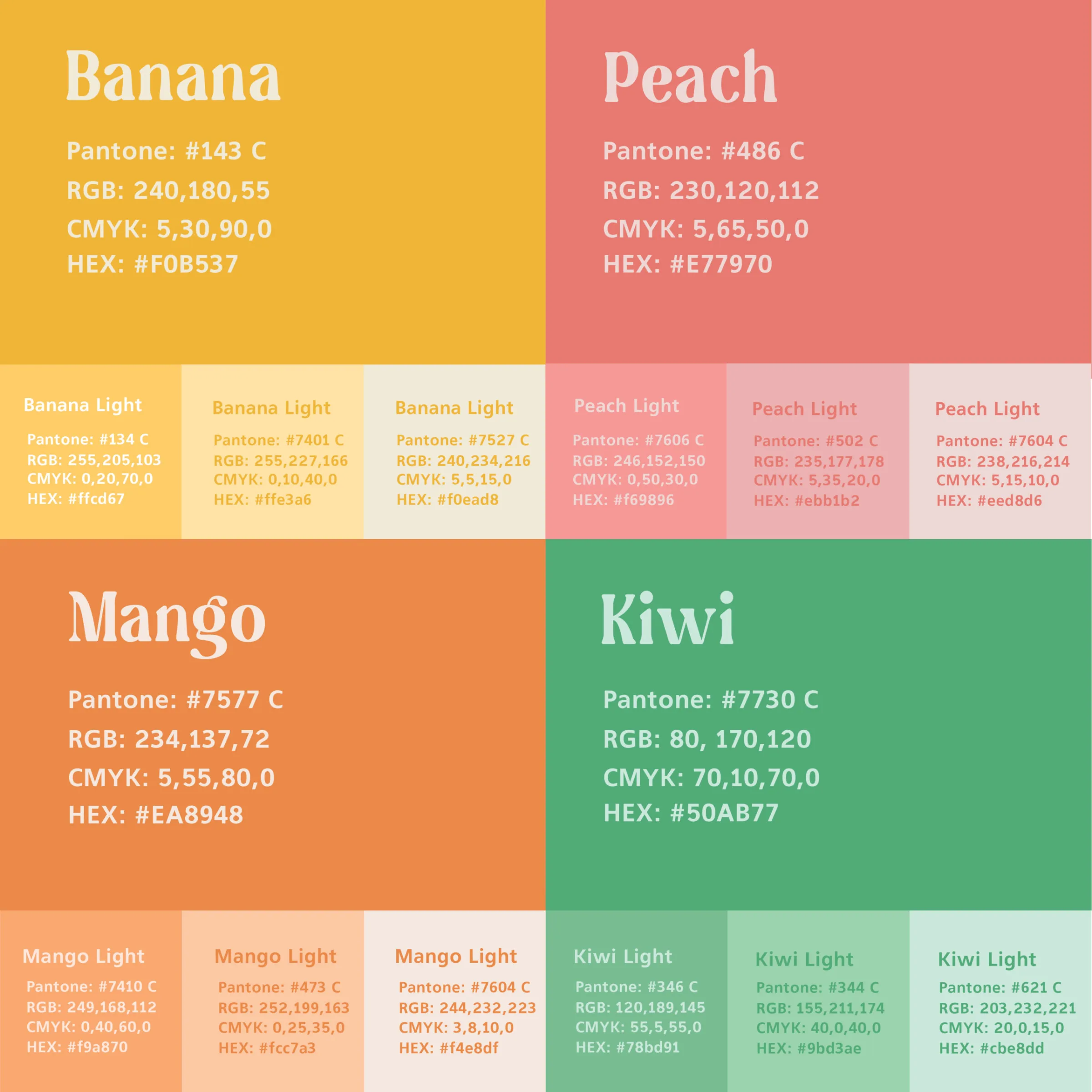
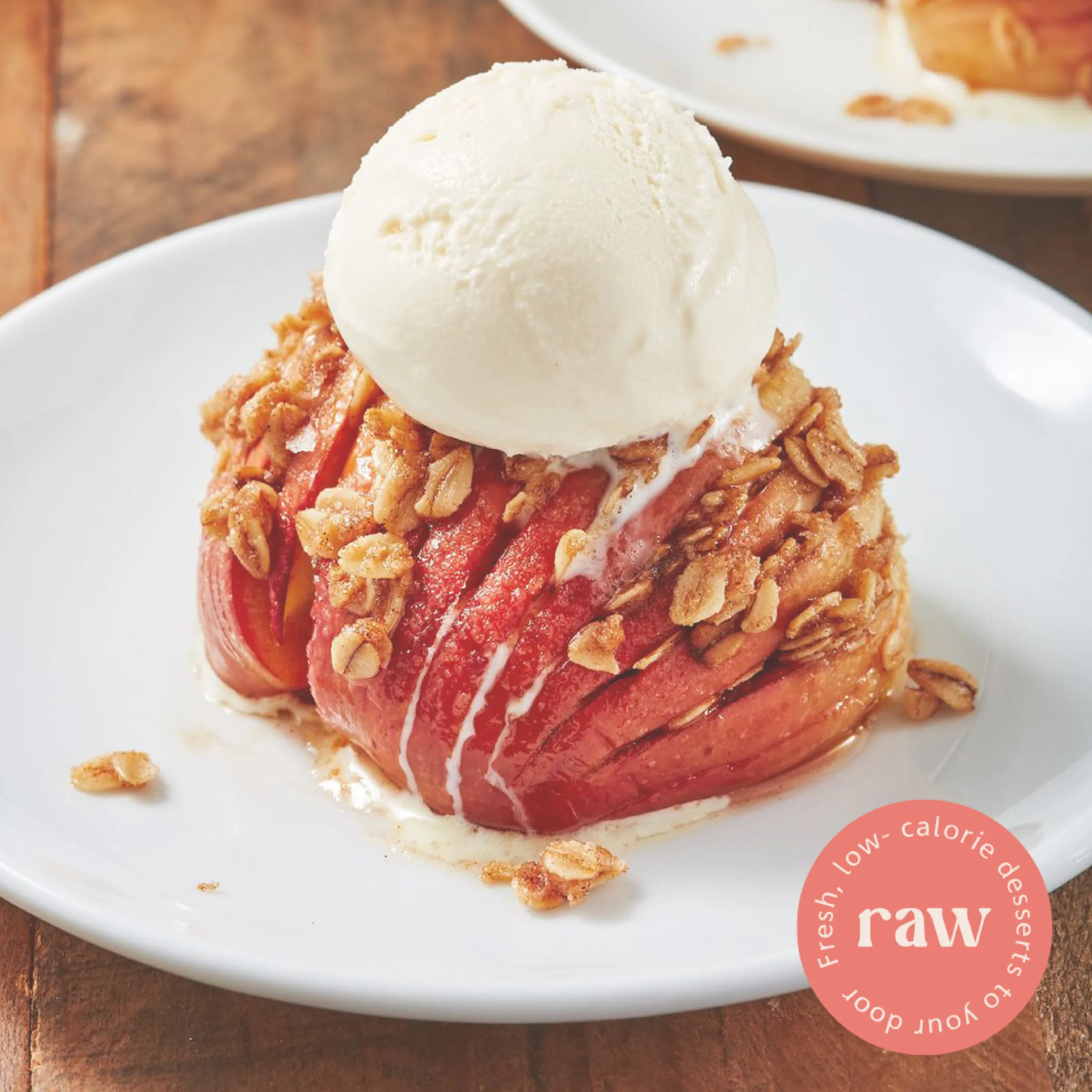
The brand is named Raw and set in lowercase; in the round version, the line “Fresh, low-calorie desserts to your door” circles the name. The palette has four main colours named after fruit — banana, peach, mango and kiwi — each with three lighter tints and Pantone, RGB, CMYK and HEX values. Headlines are set in Magilio and text in Agane, on a single type scale. The pattern is made of line icons of fruit and pastry tools: a pineapple, a melon, a spatula, a pear, an orange, a whisk, a mango and a strawberry.
The system is applied to:
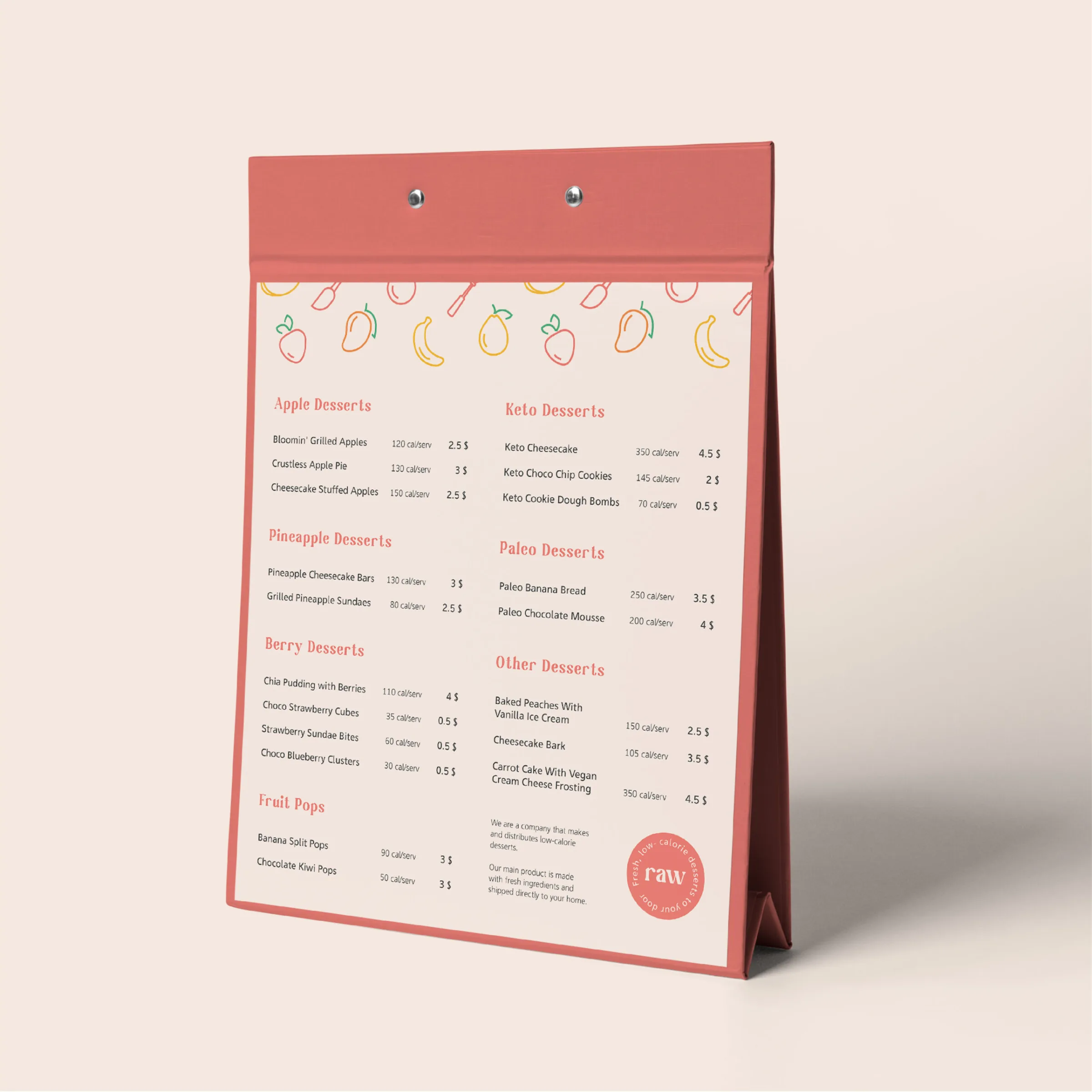
- a table-top menu listing the desserts and the calories per serving;
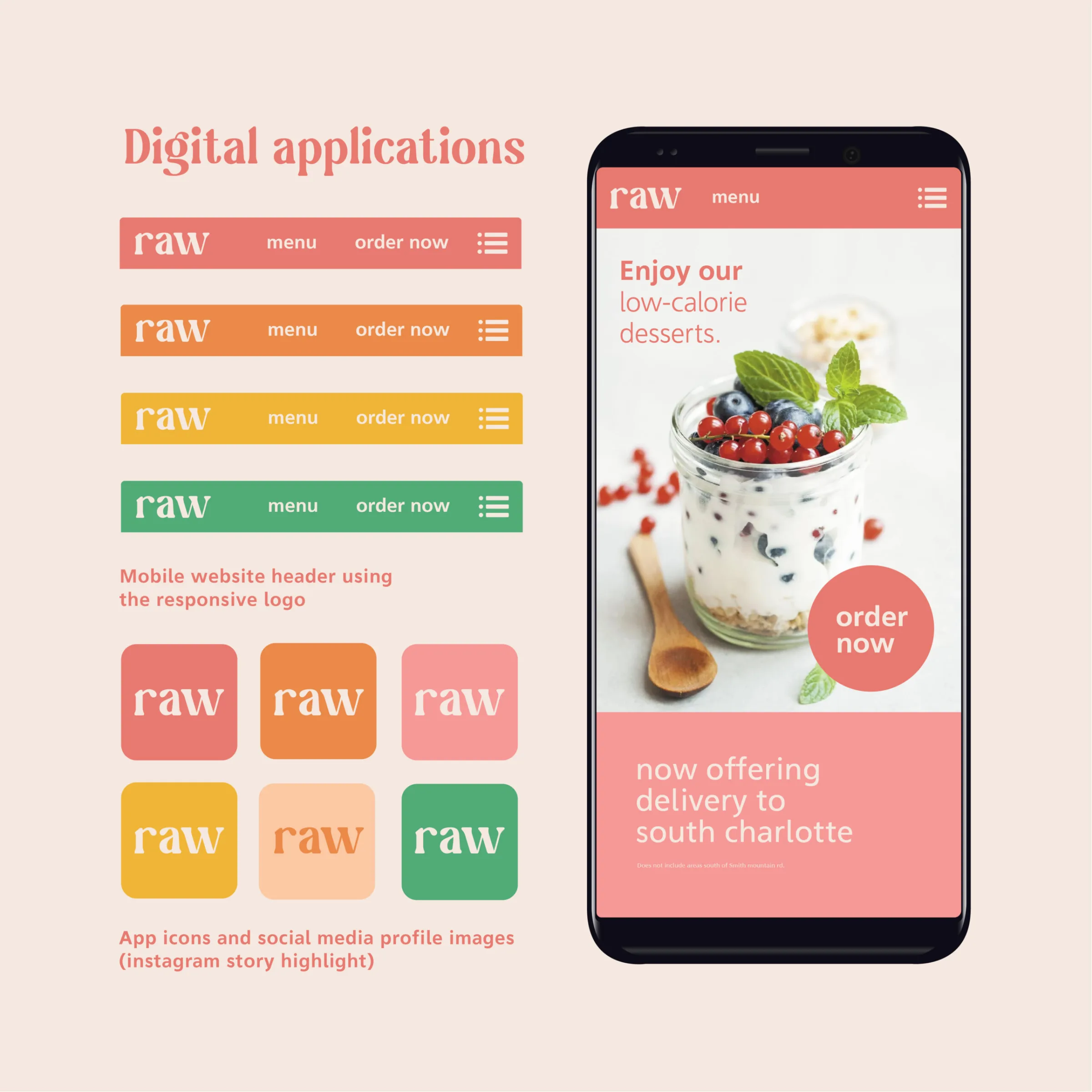
- the logo in a mobile site header, app icons and Instagram highlight covers;
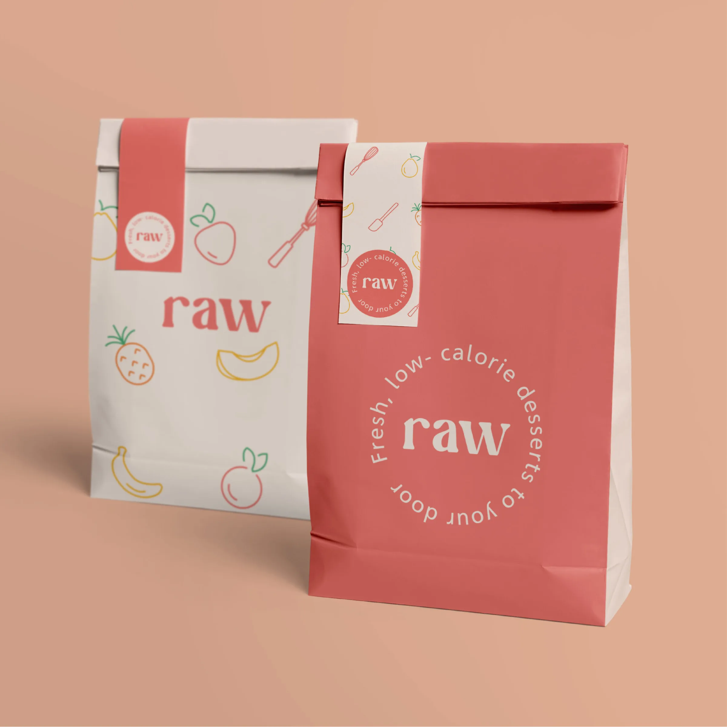
- paper bags;
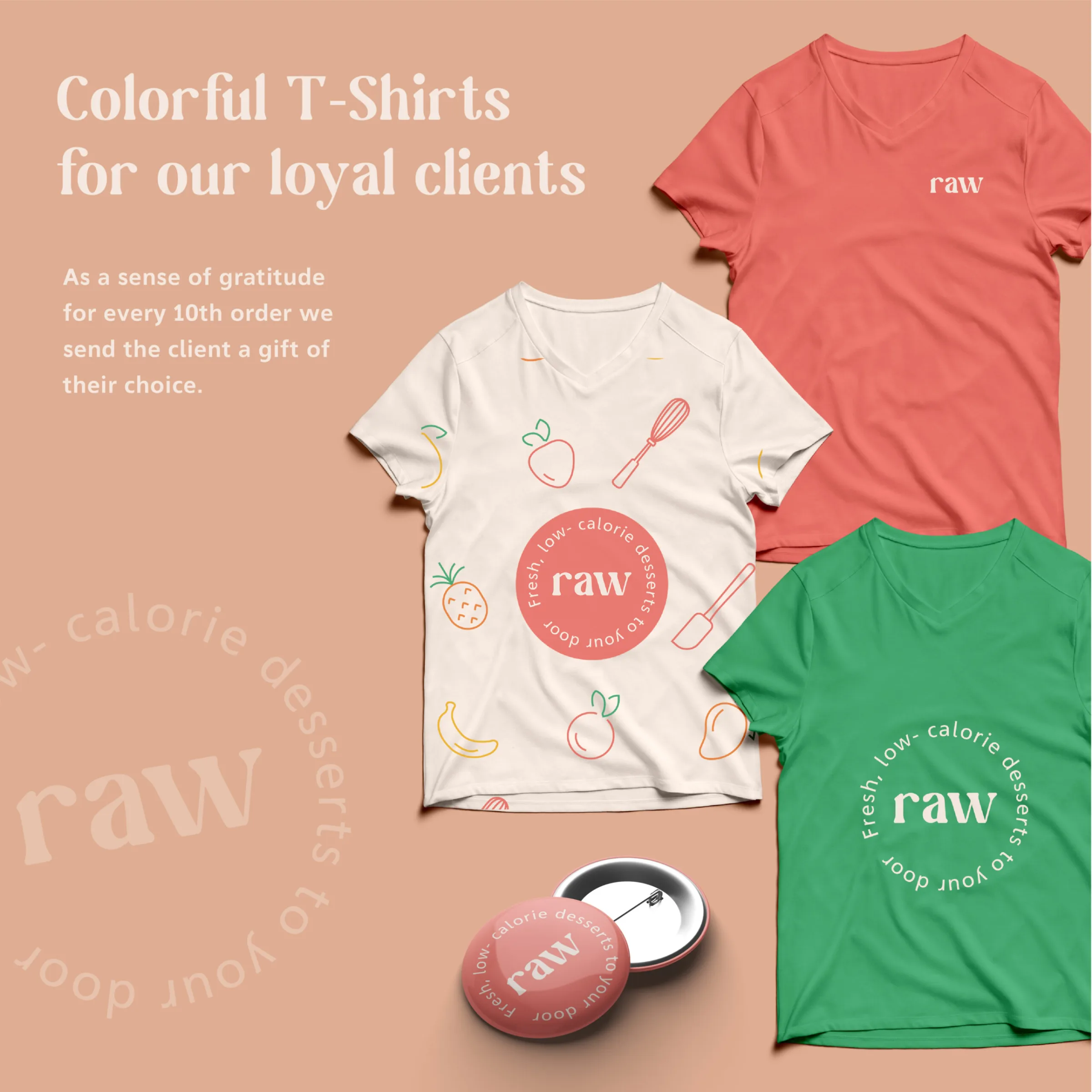
- T-shirts and a pin badge for regular customers, who get a gift with every tenth order;
- photographs carrying the round badge.
Gallery