ARCHIVE PROJECT
Malluable: logo
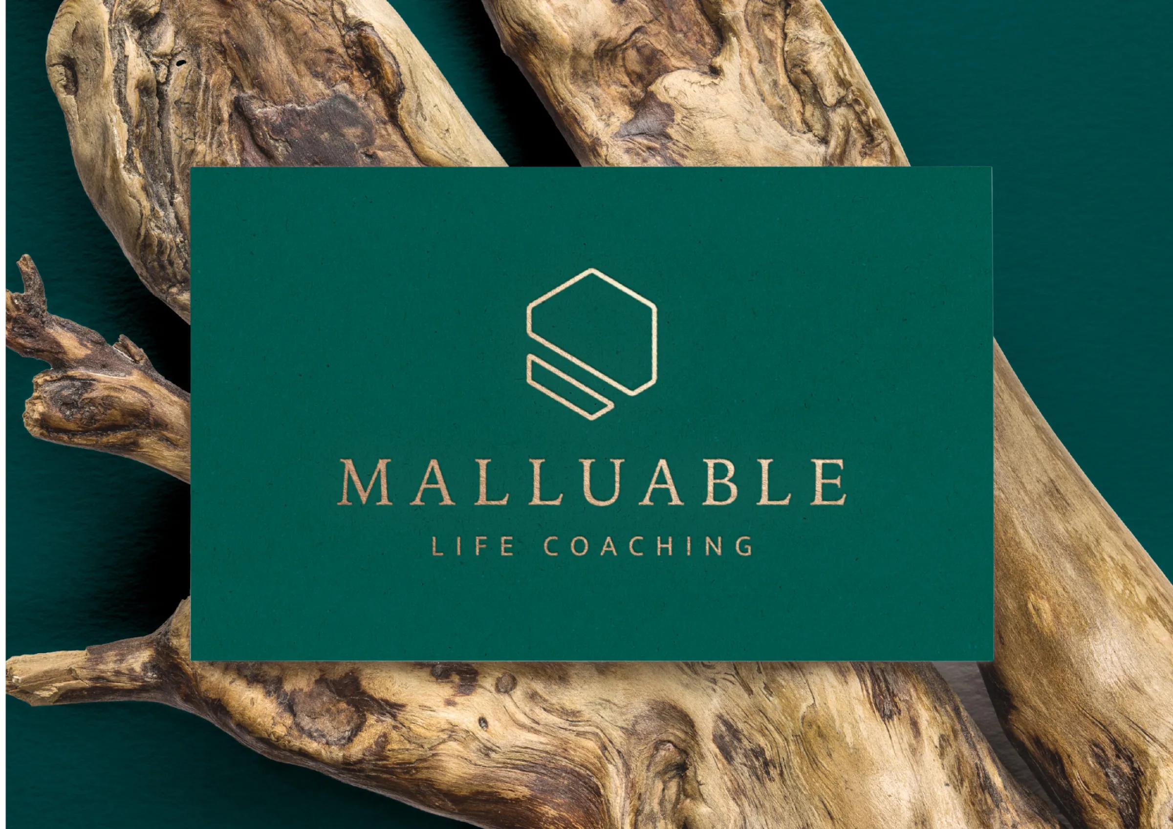
Gold on deep green. The name comes from malleable.
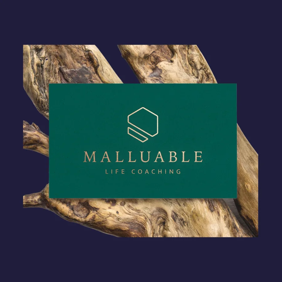
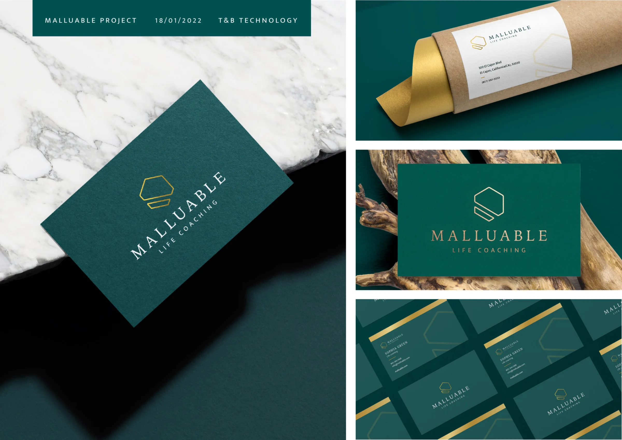
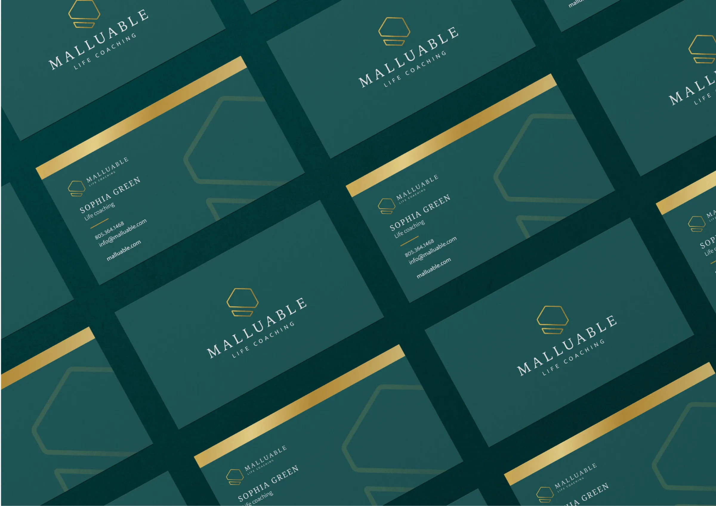
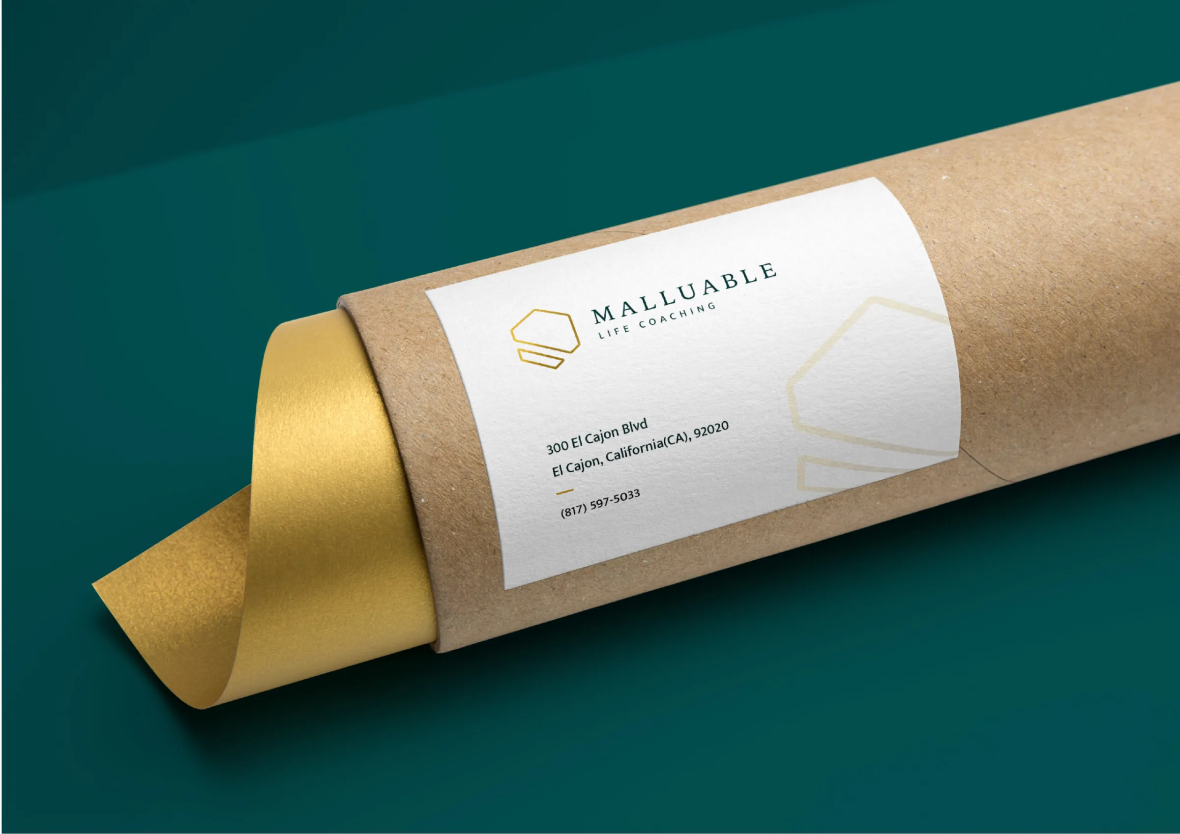
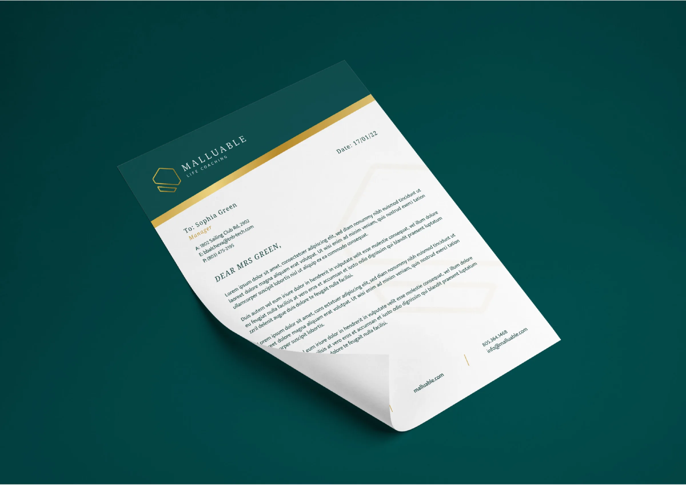
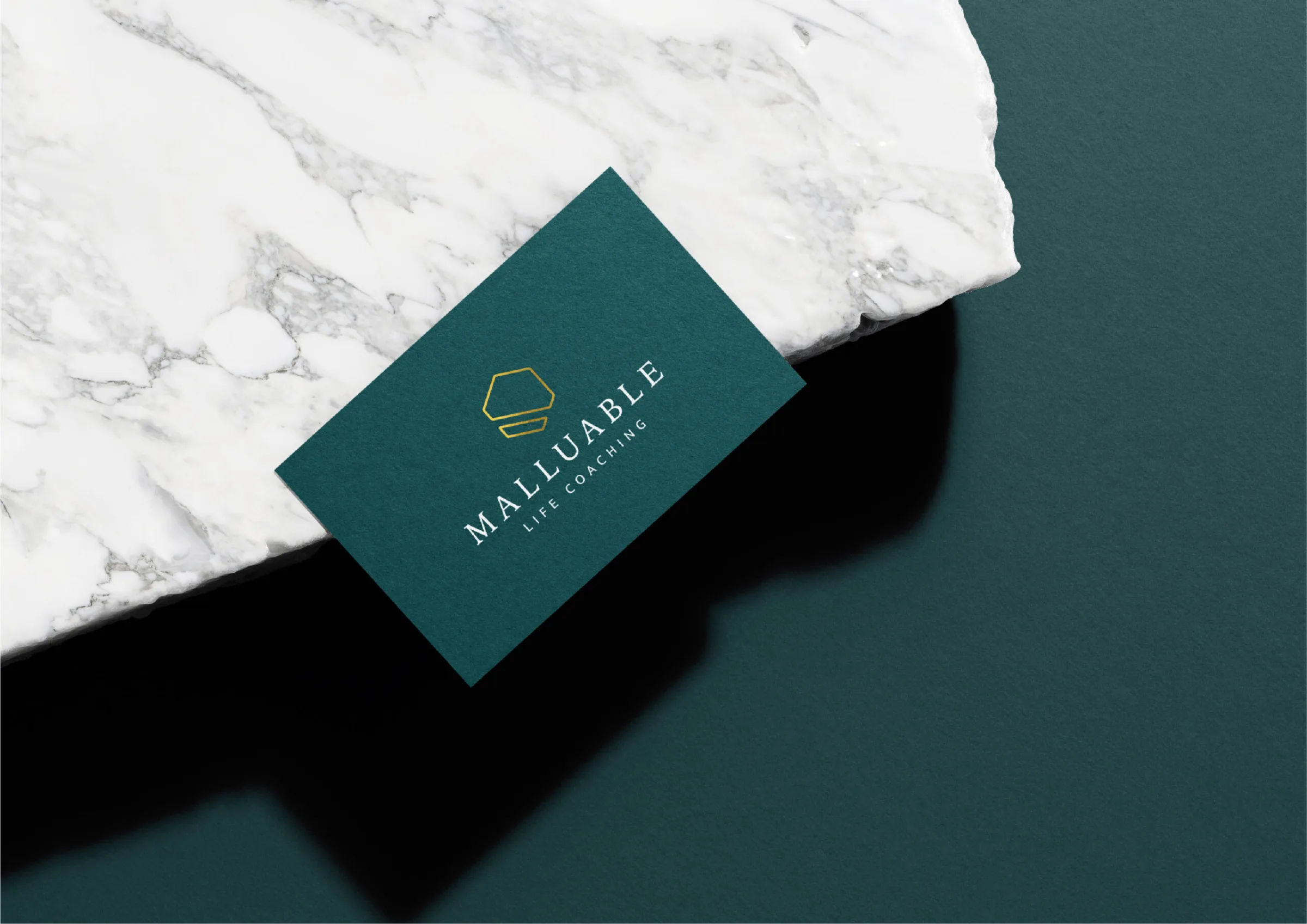
A logo for Malluable, a life-coaching practice for entrepreneurs and business owners, with business cards, a letterhead and a label for a cardboard tube.
CONTEXT
Malluable coaches successful entrepreneurs and business owners who are looking for the next step in their careers, helping them narrow their focus and make big life and business decisions without feeling overwhelmed. The name comes from malleable: easy to bend and reshape. In the spelling MALLUABLE, the U underlines how personal the coaching is.
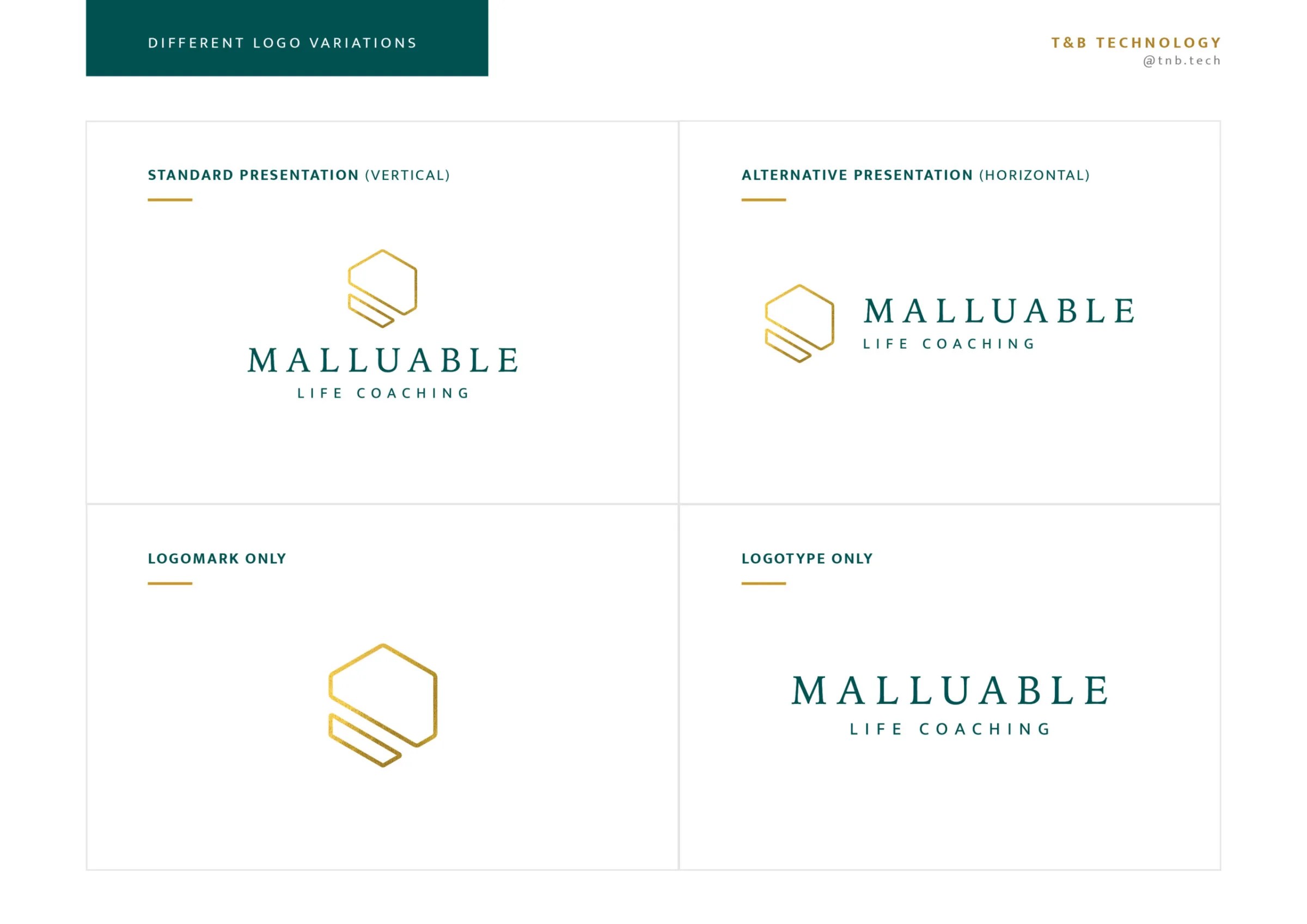
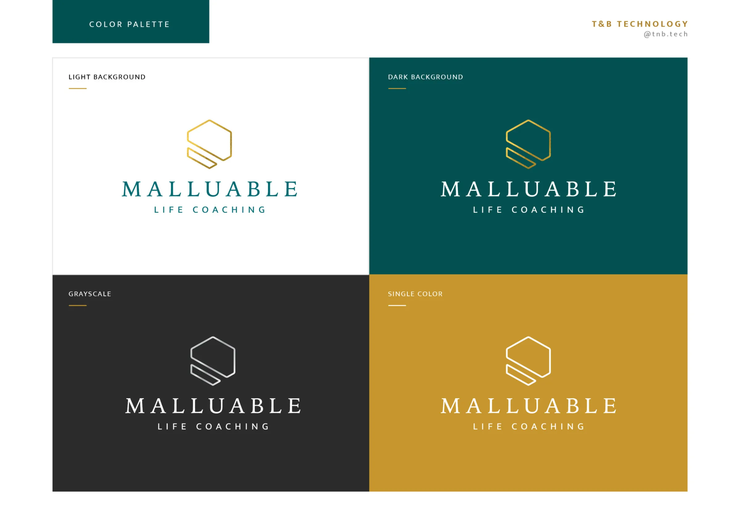
We design the logo to the client’s brief. The client wants a metal in the identity, gold in particular, because it ties in with the whole idea behind the practice. We pair the gold with a rich dark green for a professional look. The logo is a gold line symbol above the name, set in widely spaced serif capitals, with the line LIFE COACHING.
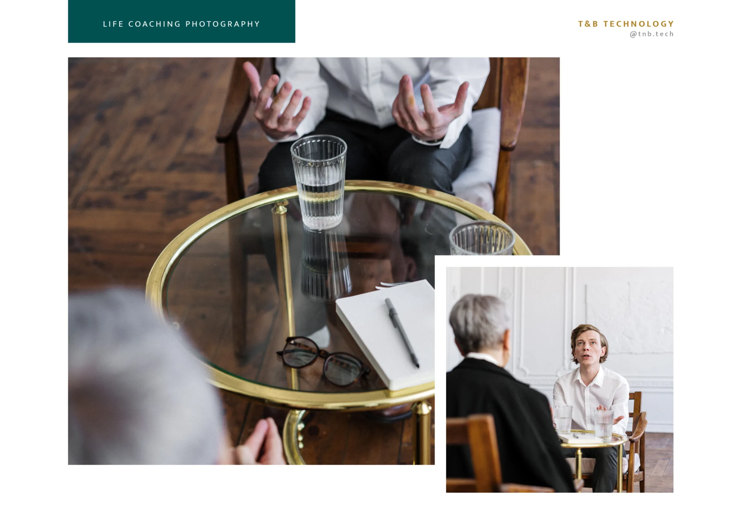
The system covers vertical and horizontal versions of the logo, the symbol and the wordmark on their own, versions for light and dark backgrounds, greyscale and single colour, and a direction for photography. On that base we make:
- business cards;
- a letterhead;
- a label for a cardboard tube.
Gallery
MORE FROM THE ARCHIVE
DS Women's Place: logo
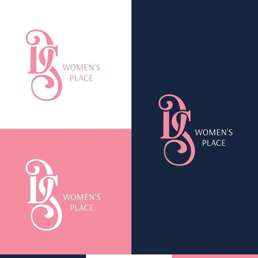
An interlaced D and S. Pink, navy and white.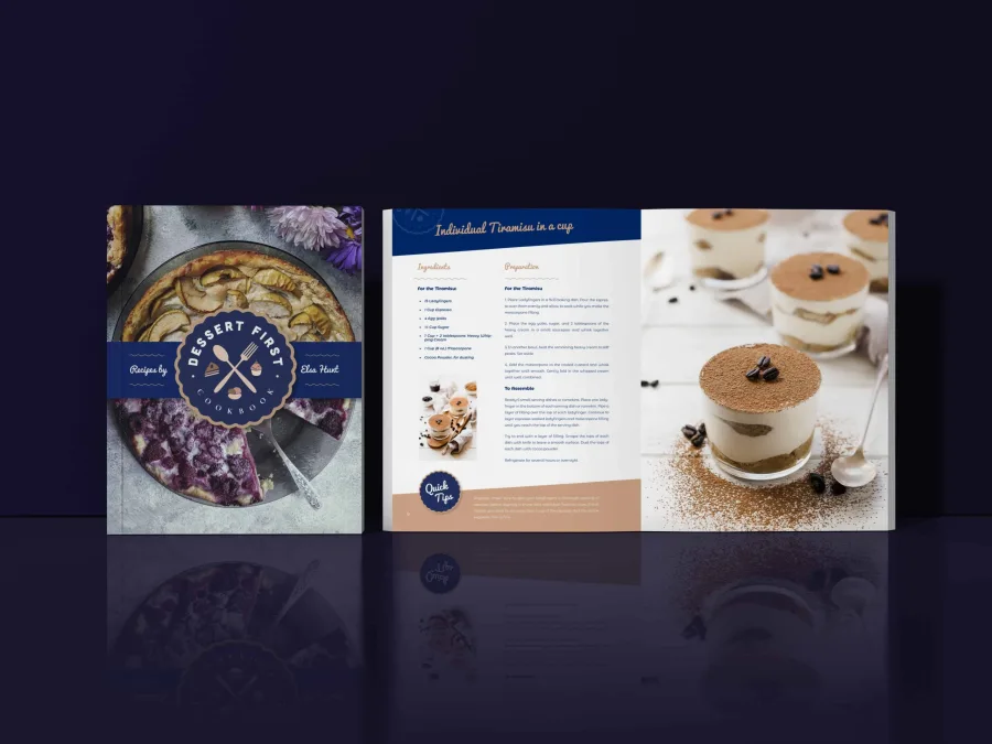
Dessert First Cookbook: book design
A round badge on the cover. Recipes in two columns, full-page photographs.