Logo design: 7 principles every good logo follows
Research, legible lettering, scalability, variations, colour psychology, simplicity and the right typeface: the seven principles behind a logo that works.
Boryana Balcheva · · UPDATED
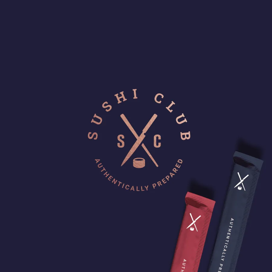
A good logo is a long-term investment. It is the “face” of a company and one of the most important keys to success for any business. A logo is how customers recognise a company and connect it with its products.
If you are starting a new business, you will certainly need a professional logo. See what goes into logo design and what drives the price.
Selected work
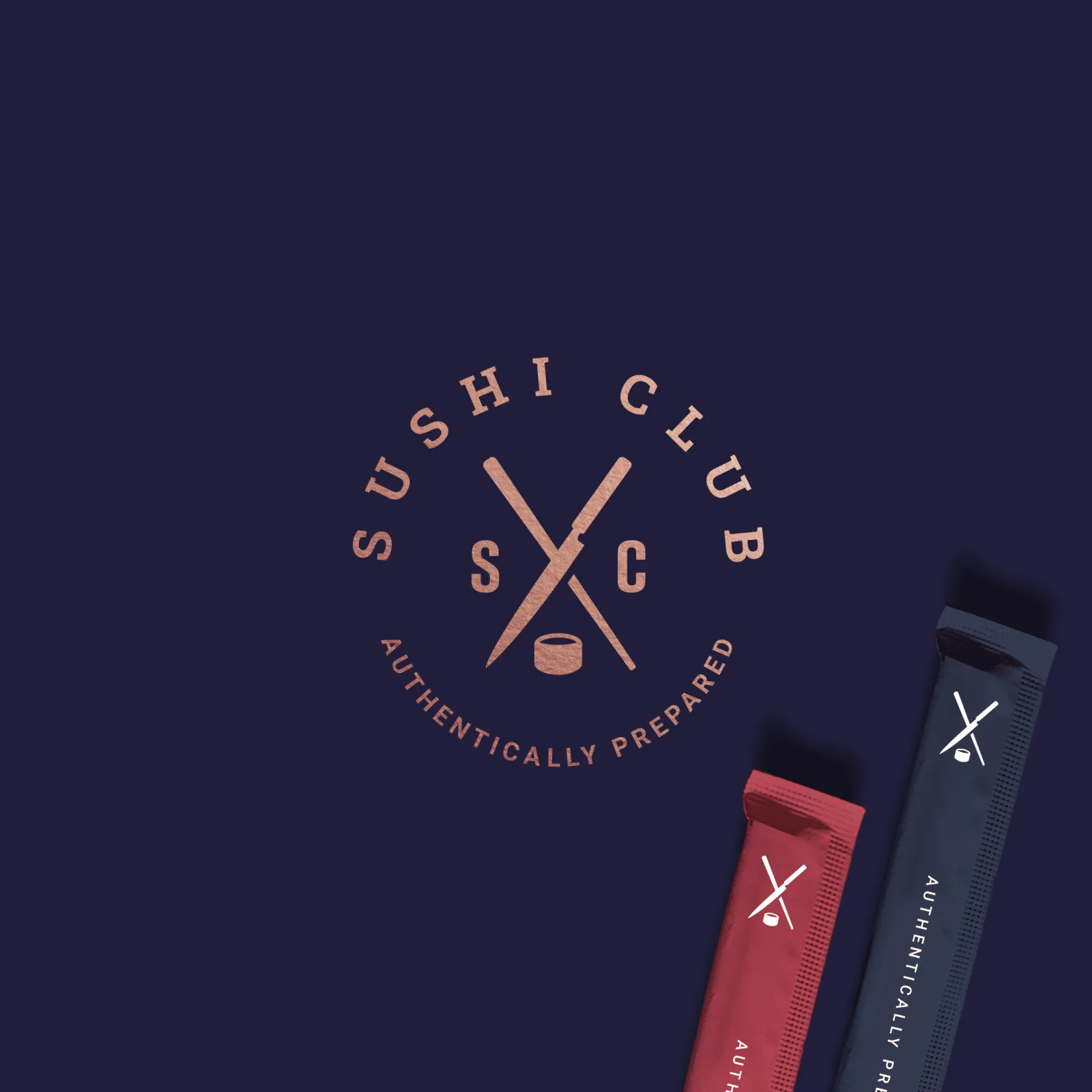
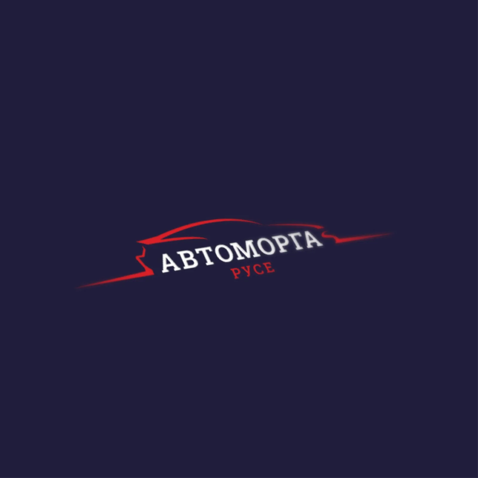






Now let’s look at the seven core principles of a successful logo.
1. Research and define your target audience
The most important step in creating a logo is to research thoroughly and define your target audience correctly. A logo’s main job is to attract more potential customers and show them why your brand is right for them.
A good way to research your ideal audience is to analyse your competitors: what they do, and which fonts, colours and shapes they use. You then use that information to create a better logo.
2. Legible lettering
Bear in mind that people see your logo for just 3 to 5 seconds. That is all the time you have to catch their attention and make them remember your brand.
You can have the best logo there is, but if the name can’t be read, customers will be put off dealing with you.
Ask people outside the project to check that the brand name is easy to read. If they struggle, switch to a simpler font.
3. A scalable logo
Before you start designing your logo, you need to know where it will be used: on websites, on social media, in print…
To make sure the logo looks good at any size, create several variations, with more or less detail depending on the space. Use the version with less detail in tight spaces, so it stays easy to read.
4. Logo variations
Create vertical, horizontal and square versions of the logo so it fits every place it will appear.
Think about colour as you design, too. You will need several colour versions: black and white, single colour and so on.
All of this information and guidance comes together in a brand book: the set of rules and standards for using the logo, the colour palette, fonts, text and so on. Find out more about what branding covers.
5. Colour theory and psychology
Colours are a powerful tool in graphic design: each has its own meaning and can convey different feelings and emotions.
Use the colour palette well and people will automatically link the services or products you offer with your brand. So what emotions do you want your customers to feel?
6. Keep the logo as simple as possible
Try to say more with fewer elements. Once the design is finished, remove anything unnecessary without changing what the logo means. That makes it easier for people to remember.
7. Choosing a typeface
Every typeface gives a design meaning and character. Some are bold and confident, others elegant and refined. That is why you should choose a combination of fonts that reflects your brand’s look and values.
Get in touch
To see some of our projects, visit our portfolio and our Facebook and Instagram pages.
Contact us and we will help you design your logo.
We turn these principles into a mark through logo design: a brand-new mark, or a logo from your sketch.
Logo design
Logo design: two concepts, up to three revisions, files for print and screen.
CASE STUDYThe Book: a visual identity, Canva templates and printed materials for a dark-romance bookstore
A visual identity for The Book, an online bookstore for dark-romance fiction: logo, palette and type, then Canva templates and printed materials for readers.
Boryana Balcheva
<p></p>