Design as a language: how a visual identity “speaks”
How visual identity has become a language that brands use to communicate their values, position and character without saying a word.
Selli Porteva ·

Visual identity as a brand’s first message
Attention is limited and content is everywhere, so the first impression of a brand often happens without words. Before any text is read or any slogan is heard, the visual identity has already “said” something. Colours, shapes, rhythm and composition work as a language that audiences understand intuitively. That is why design today isn’t just aesthetics but an active communication tool.
How a visual identity builds meaning and character
A modern visual identity is a system of meanings, not a collection of separate elements. The logo, typography, colour palette and visual style work together to create a sense of character. Minimalist design can communicate confidence and clarity, while more expressive choices suggest creativity and energy. In that sense, a visual identity doesn’t just show what a brand looks like; it shows how it thinks and what it stands for.
Visual identity as a position, not decoration
More and more brands realise that design isn’t neutral. Every visual choice takes a position, even when it isn’t meant to. The way a brand looks shows whether it is bold or cautious, approachable or distant, modern or conservative. A well-built visual identity lets a brand express its values and attitude without stating them outright. With today’s sceptical audiences, that is often more convincing than any message.
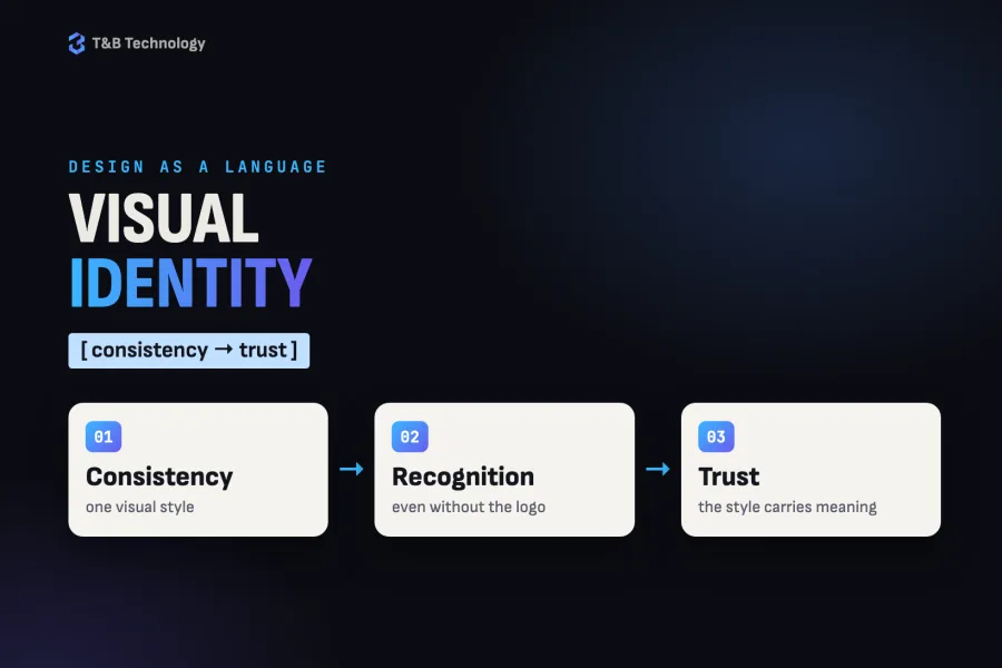
Consistency that builds trust
When a visual identity is consistent, it starts to work on its own. People recognise the brand even without the logo, because the visual style already carries meaning. Consistency doesn’t mean uniformity; it means a clearly defined system that can adapt without losing its character. It is through this consistency that trust is built: the brand comes across as stable, secure and deliberate in how it communicates.
Emotion as part of the visual language
One of the greatest strengths of a visual identity is its ability to evoke emotion. Colours affect mood, shapes create a sense of security or tension, and typography can be strict, friendly or playful. These elements work subconsciously and often decide how a brand is perceived before anyone thinks about it rationally. When design is built strategically, it doesn’t just look good; it creates an experience.
Visual identity in a digital world
Today visual identity lives mostly in digital spaces: social media, websites, apps. Every platform has its own limits and formats, but the brand has to stay recognisable everywhere. This is where design as a language shows its strength. A well-built visual identity can adapt to different channels without losing its clarity and character.
A language without words
Design stopped being just about appearance a long time ago. Visual identity has become a language that brands use to communicate values, position and character without words. In a world of constant noise and fast scrolling, it is this visual language that makes brands recognisable and memorable. Brands that understand the power of visual identity rely not only on messages but on feelings, and that is exactly what sets them apart.
If your question goes beyond one article and is about the whole brand rather than a single detail, here is how we approach branding, from identity to brand book.
Graphic design
A face people remember: graphic design from one team.
CASE STUDYArte: social media, TikTok, brochures and campaigns for a food producer
Facebook and Instagram with their ads, videos, a TikTok profile built from scratch, monthly brochures and gift campaigns for Arte — a Bulgarian staple-food brand (rice, beans, lentils, sugar, pasta and preserves) distributed nationwide.