The power of colour in design: how colour psychology works
How colour psychology influences customers, and why choosing the right colours in design matters so much for a brand.
Selli Porteva ·
What is colour psychology?
Colour psychology in web design and marketing
How to use colour psychology strategically
Colour psychology and user experience
The takeaway
Colours are one of the most powerful tools any designer or marketer has. They shape a brand’s visual identity, and they also have a deep effect on people’s perceptions, emotions and behaviour. In digital marketing, where the user’s attention matters so much, colour psychology becomes a strategic element that can make or break a project.
What is colour psychology?
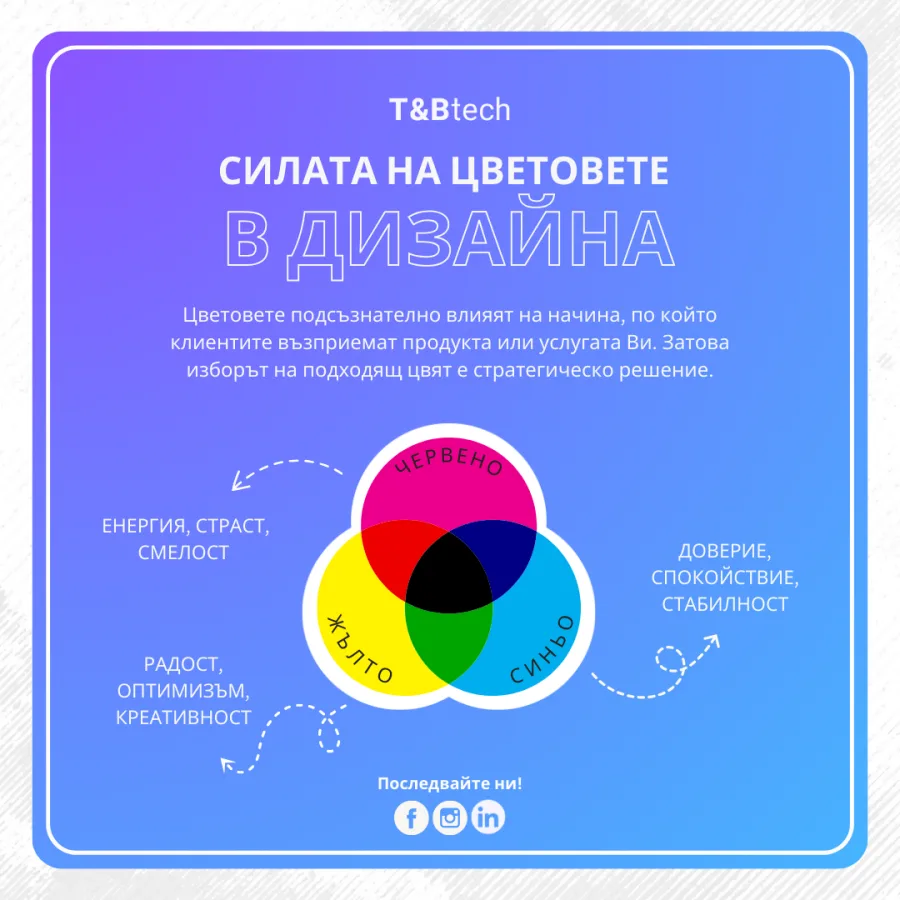
Colour psychology is a branch of psychology that studies how different colours affect human emotions, perceptions and patterns of behaviour. Since ancient times, people have linked colours with particular meanings: red with passion and danger, green with nature and harmony, blue with trust and calm. Modern science confirms that these associations are not random. They have a real effect on how people perceive content, products and brands.
Colour psychology in web design and marketing
Online, where a first impression forms in a fraction of a second, colour psychology is key to building an effective user interface (UI) and a positive user experience (UX). Colours can prompt the user to take a specific action, such as clicking a button, filling in a form or completing a purchase.
Examples of what colours do:
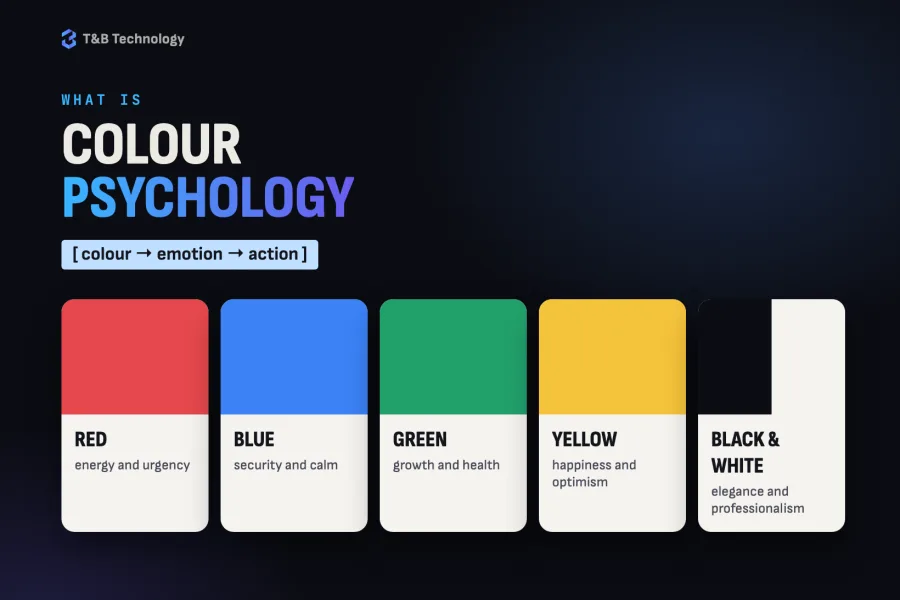
- Red: stirs energy and a sense of urgency. Often used in promotions and on “Buy now” buttons.
- Blue: stands for security, intelligence and calm. A favourite of banks, software companies and social networks.
- Green: associated with growth, health and the environment. A good fit for products built around sustainability.
- Yellow: brings a feeling of happiness and optimism. Ideal for catching attention, but best used sparingly.
- Black and white: convey elegance, minimalism and professionalism. Often used in luxury design and on corporate websites.
How to use colour psychology strategically
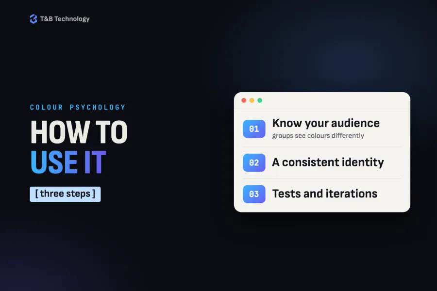
1. Know your target audience
Different demographic groups perceive colour differently. Younger users, for example, may be drawn to bold, contrasting colours, while older people tend to prefer more muted, classic tones. It is important to look at the cultural and social meanings of colours, especially for global brands.
2. Build a consistent visual identity
Your colour palette should be in step with your brand message and applied consistently across every digital channel: your website, social media, ads and even email marketing. With colour psychology we can build recognition and trust.
3. Test and iterate
A/B tests of different colour versions of key elements (such as CTA buttons) can show which combinations lead to higher conversion rates. Even a small change of shade can lift a campaign’s performance.
Colour psychology and user experience
UX design is not only about function: emotions play a central role. Colour can make users more confident, more engaged and more likely to stay on a site. For example:
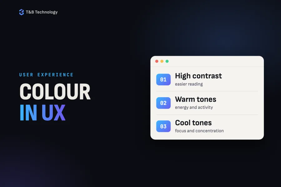
- High-contrast colours make text easier to read and navigation easier to follow.
- Warm tones encourage energy and activity.
- Cool colours help focus and concentration.
A good designer uses colour psychology to guide user behaviour without forcing it.
The takeaway
Colour psychology is not a passing trend but a proven approach in design and marketing. Used strategically, it can make the difference between an average project and a brand that leaves a lasting impression. In a digital world where competition is fierce, understanding and applying the science behind colour is an advantage no modern company can afford to ignore.
If you want design that not only looks good but also delivers results, rely on colour psychology and on the experience of professionals.
Graphic design
A face people remember: graphic design from one team.
CASE STUDYArte: social media, TikTok, brochures and campaigns for a food producer
Facebook and Instagram with their ads, videos, a TikTok profile built from scratch, monthly brochures and gift campaigns for Arte — a Bulgarian staple-food brand (rice, beans, lentils, sugar, pasta and preserves) distributed nationwide.