Imperfect design as a brand advantage
As AI tools make brand visuals ever more polished and alike, deliberate imperfection reads as human. How imperfect design helps a brand stand out, and when it is the wrong choice.
Selli Porteva ·

What imperfect design means today
In a digital world dominated by automation and artificial intelligence, visual communication is starting to look more and more uniform. That is exactly why imperfect design is gaining ground as a deliberate choice rather than a compromise. It uses elements such as type that looks hand-drawn, asymmetric compositions and visual “imperfections” that make the work feel human.
The approach does not mean a lack of professionalism. It is a strategic step away from an overly polished, predictable look. The imperfection is there to add character and make the brand easier to recognise.
Why the style is catching on
With AI tools now widely used to create visuals, many brands are starting to look alike. Algorithms produce visually “perfect” results that often lack any individuality.
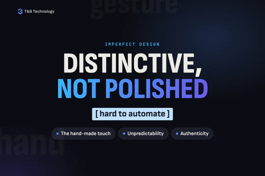
This is where imperfect design offers an alternative. It brings in an element of unpredictability and distinctiveness that is hard to automate. That lets brands stand out naturally, without relying only on scale or budget.
The link with brand authenticity
People today look for authenticity and transparency. Content that is too “polished” often creates distance, while a more natural visual language builds trust.
Imperfect elements suggest a human hand and a process behind the work. That makes communication more approachable and closer to real life. In this sense, imperfect design becomes a tool for building a stronger emotional connection with your audience.
How it affects recognition
When visual content is everywhere, attention is a limited resource. Brands that look too much like each other are easily lost in the stream.
Breaking visual expectations is an effective way to catch attention, and this is where the approach works best: through contrast and difference. When a style is clearly recognisable, it stays in people’s minds and supports the brand’s presence as a whole.
When it fits and when it does not
For all its advantages, this style does not suit everyone. It has to match the context, the industry and the audience.
It works when a brand wants to come across as more human and approachable, or when it needs to set itself clearly apart. In more conservative sectors, however, overusing visual “imperfections” can be read as a lack of professionalism.
That is why imperfect design should be used in measured doses and with a clear purpose.
How to use it strategically
Using this approach well takes balance. The imperfection has to be controlled and built into the brand’s overall visual system.
In practice, that means:
- combining expressive elements with a clear structure,
- keeping text easy to read and the design easy to use,
- staying consistent in your visual style.
Used strategically, imperfect design creates distinctiveness, not chaos.
More than a passing trend
This approach reflects a deeper shift in how brands and their audiences communicate. In an age of automation, the human element is becoming a key advantage.
Brands that manage to build this idea into their work create a stronger presence and a longer-lasting connection with their customers. Seen this way, imperfect design is not just an aesthetic but a strategic tool.
Graphic design
A face people remember: graphic design from one team.
CASE STUDYArte: social media, TikTok, brochures and campaigns for a food producer
Facebook and Instagram with their ads, videos, a TikTok profile built from scratch, monthly brochures and gift campaigns for Arte — a Bulgarian staple-food brand (rice, beans, lentils, sugar, pasta and preserves) distributed nationwide.