ARCHIVE PROJECT
Accademia Italiana: logo redesign
An A built from solid blocks. Blue, turquoise and purple zigzags.

We redesign the logo of Accademia Italiana, a fashion, design and photography university in Florence and Rome, and carry it onto promotional materials.
CONTEXT
Accademia Italiana is a university with campuses in Florence and Rome that has taught fashion, design and photography since 1984.
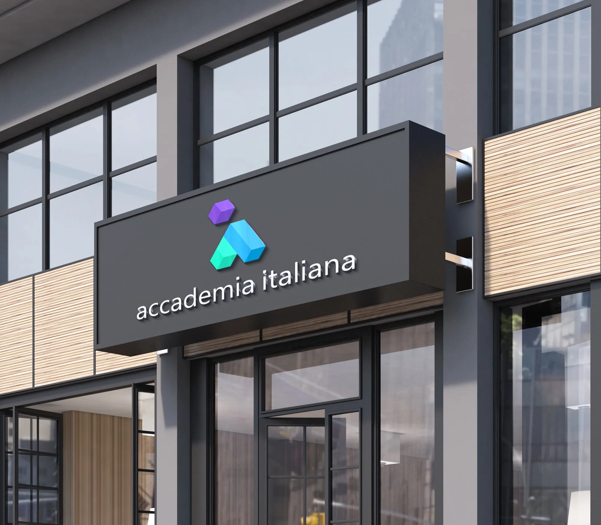
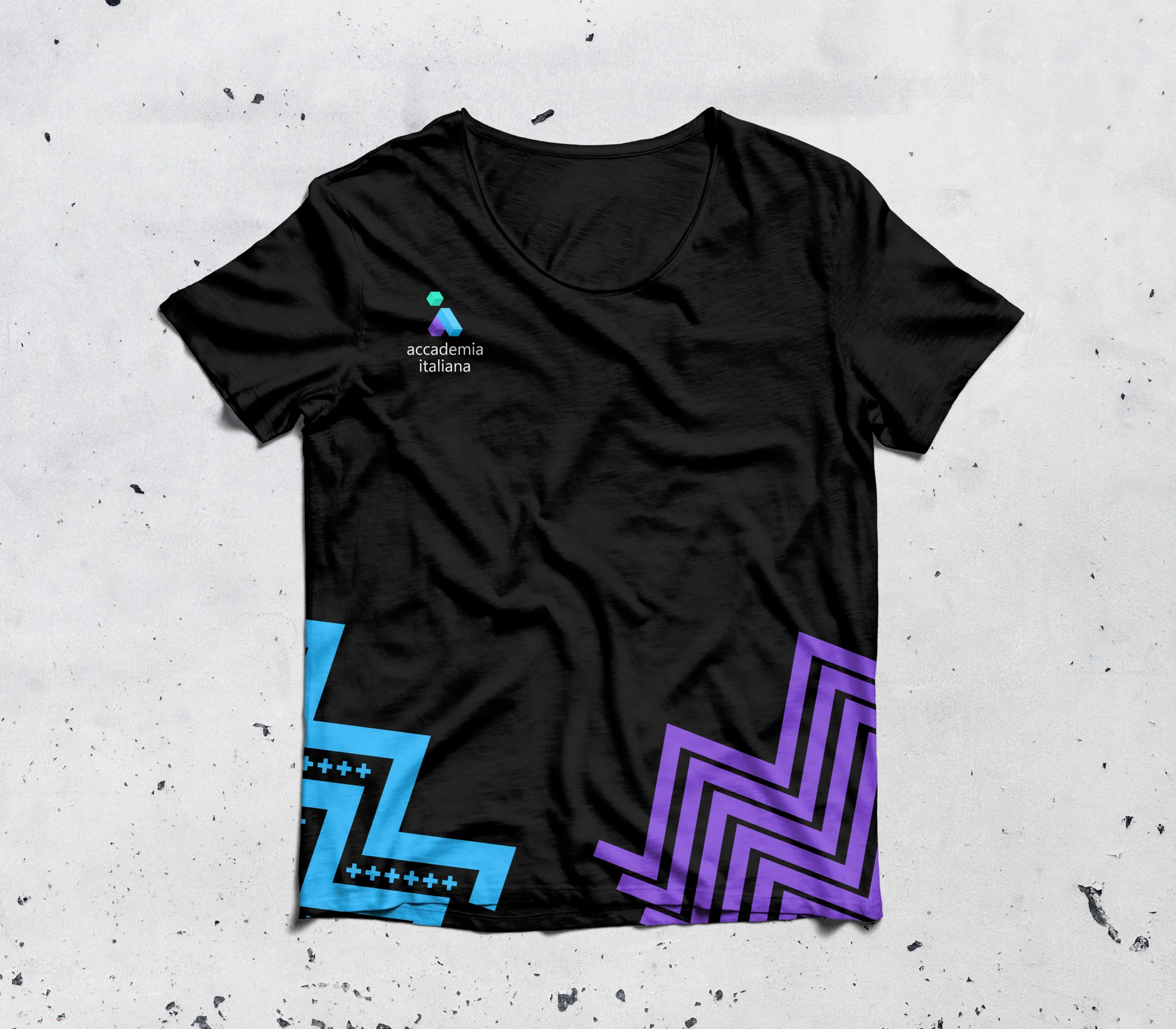
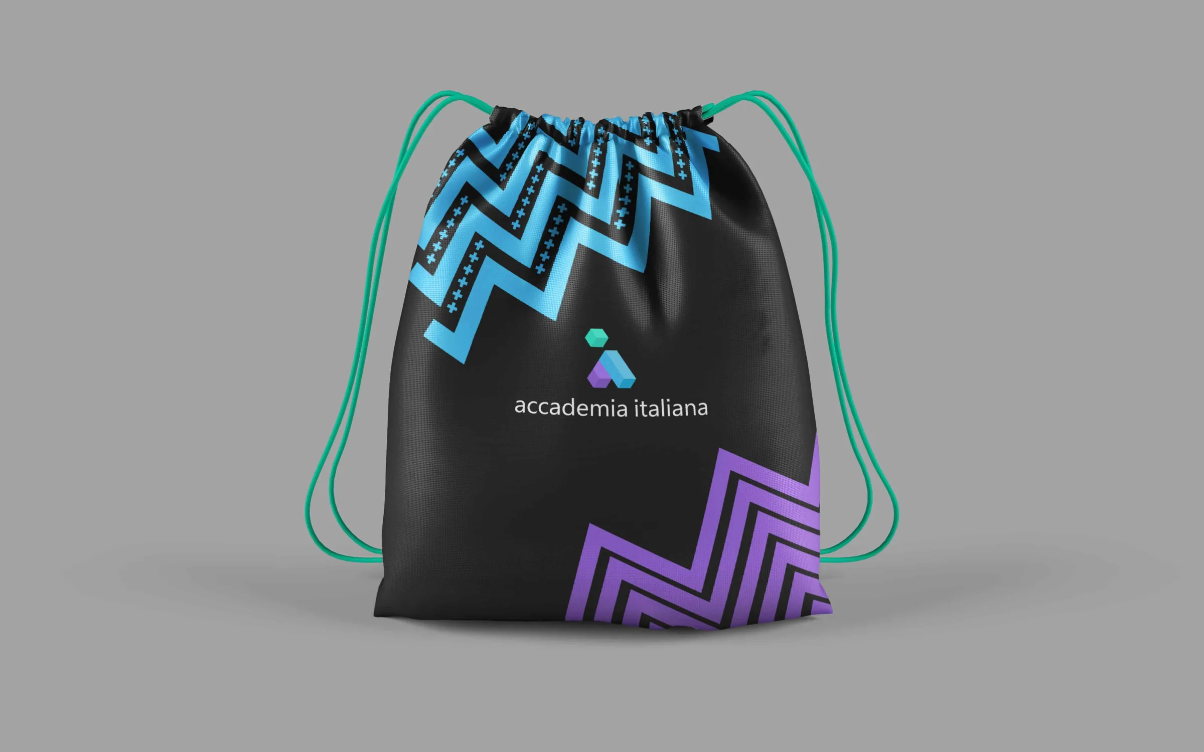
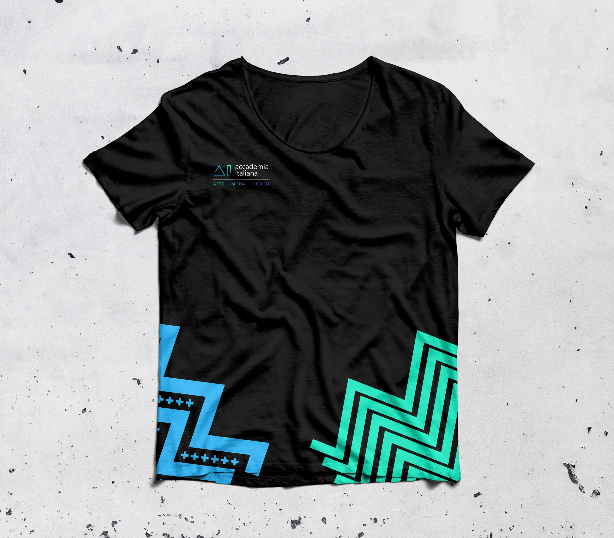
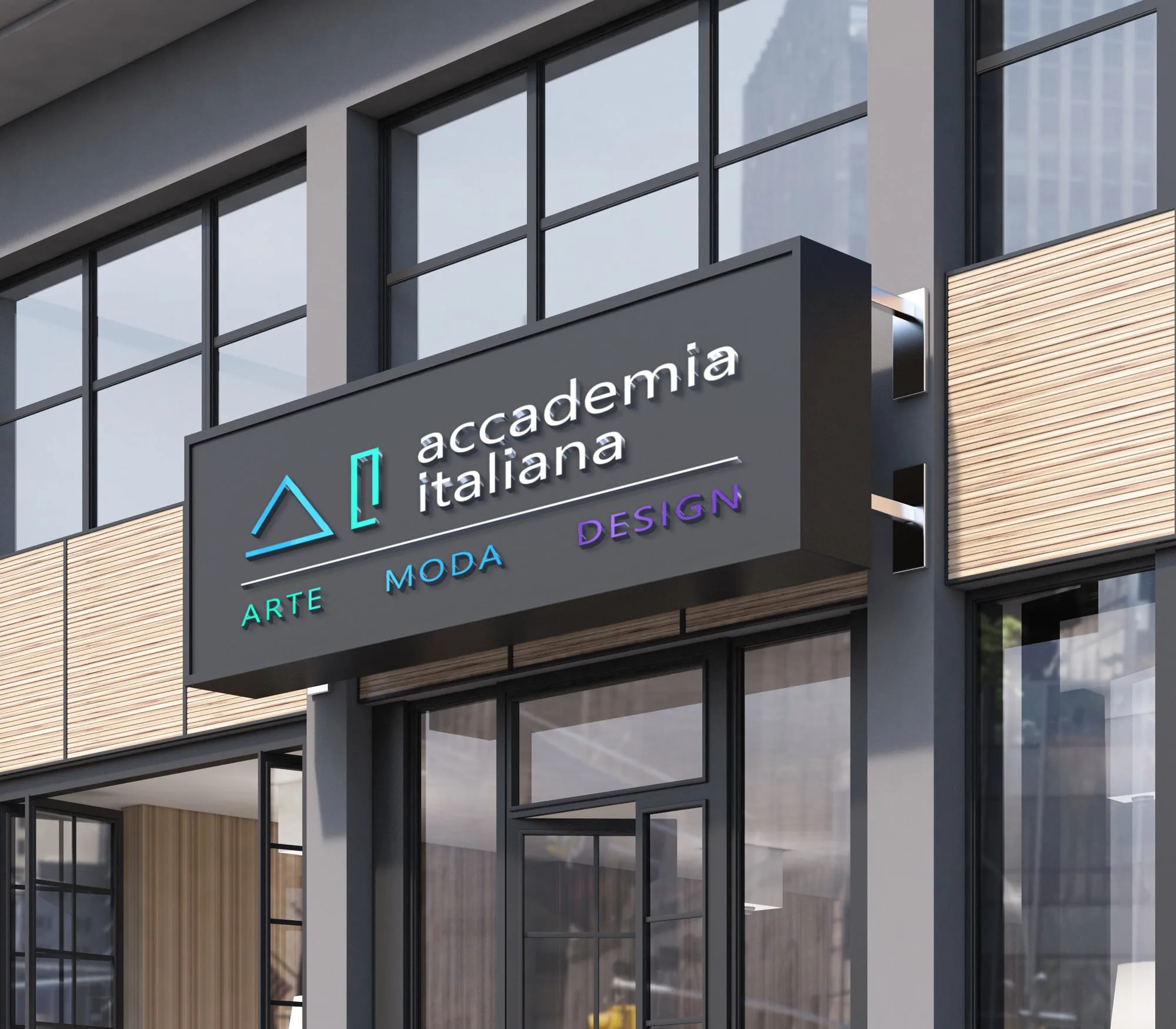
The job is to redesign the existing logo and apply it to promotional materials: photographs, signs, T-shirts, bags, business cards and coffee cups. We show two versions of the mark: an A built from solid blue and purple blocks under a turquoise cube, and a line version made of a triangle and an upright rectangle, with the words ARTE · MODA · DESIGN. Both set the name in lower case. A palette of blues, turquoises and purples carries into zigzag bands on black T-shirts and a drawstring bag, and the presentation puts the logo on a shop-front sign and over a wall of fashion sketches.
Gallery


MORE FROM THE ARCHIVE
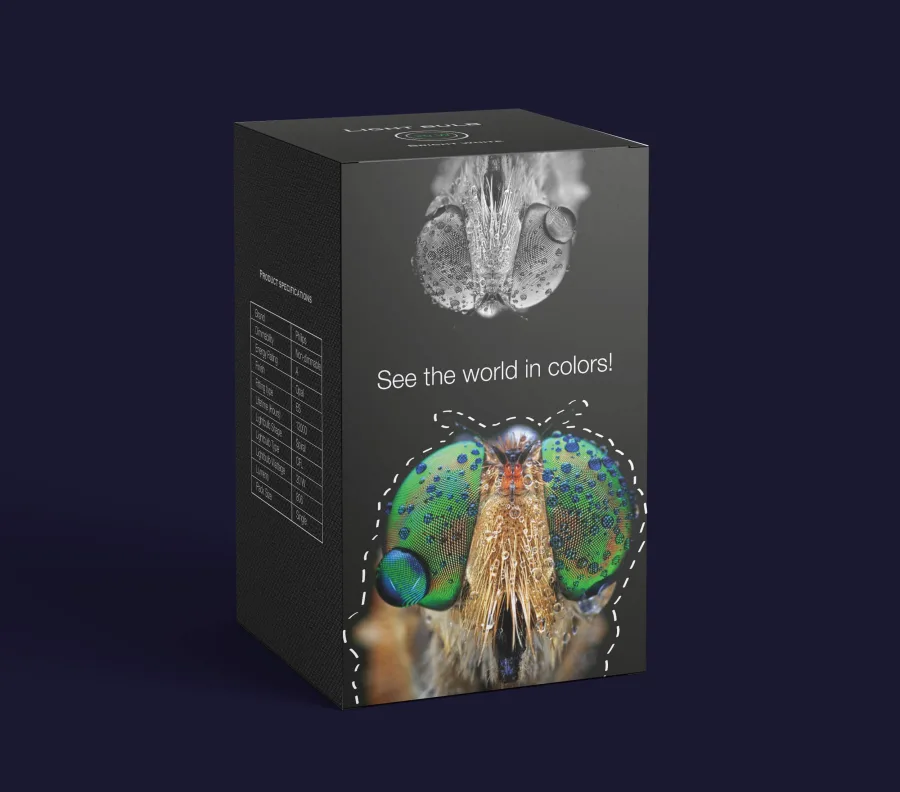
Light bulb packaging: 8, 11 and 20 W
A black box and a glow-in-the-dark insect for the wall.
Eloise Cafe: logo and branding
A vintage logo with the year the café was founded, from the shop sign to the mugs.