5 UX mistakes that cost your online store sales
Five common UX mistakes that quietly cost online stores sales, and how to avoid them to win more customers and better results.
Selli Porteva ·

In e-commerce, where competition is fierce, user experience decides who succeeds. Even small UX mistakes can be expensive: they cause confusion and friction, and in the end they lose you customers. A well-built customer journey encourages trust and purchases, while gaps in design and functionality drive visitors away before they ever reach the final step.
Below we look at five of the most common UX mistakes online stores make, and how to avoid them.
1. Complicated, confusing navigation
Navigation is the road map of any online store. If it is cluttered, illogical or confusing, people lose their way and give up. It is one of the classic UX mistakes that cut sales at the very start of the customer journey.
Overly long menus with dozens of categories, no visible search button or products sorted in the wrong order all create a sense of chaos. A customer should reach the product they want in as few clicks as possible.

2. Slow loading that cuts conversions
A slow site is a sure way to lose customers. This UX mistake is especially dangerous because it doesn’t just annoy people; it also hurts your ranking in Google. Research shows that a delay of even one second can lead to a noticeable drop in conversions.
Visitors expect pages to load instantly. If they wait too long, they leave and choose a competitor with a faster experience. Optimising images, using caching and cutting unnecessary scripts are just some of the steps that improve speed.
3. No mobile optimisation
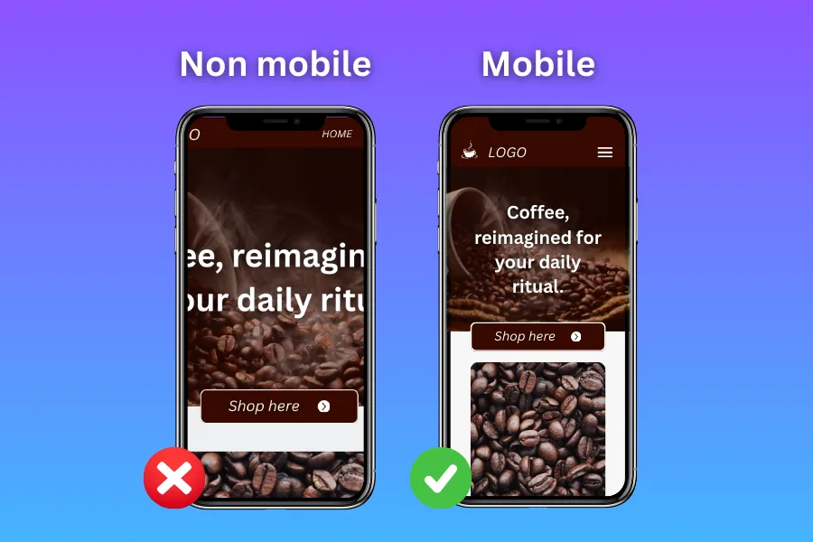
Today more than half of online purchases are made on mobile devices. A site that isn’t adapted to them is making a serious UX mistake, one that directly reduces potential revenue.
Many online stores still underestimate the mobile experience. Badly sized buttons, text that is hard to read or forms that are awkward to fill in make people abandon their basket. Responsive design isn’t an optional extra; it is a basic requirement for any modern online store.
4. A complicated checkout that drives customers away
Checkout is the decisive moment. The customer has chosen a product and is ready to buy, but if the last step is too complicated, there is a good chance they will give up. That makes it one of the most expensive UX mistakes: it stands in the way of the actual sale.
Long registration forms, hidden fees and unnecessary fields wear people out. The more barriers you put up, the more likely the basket is to be abandoned. The most successful online stores offer a quick-purchase option, ask for the minimum of details and show the final price from the start.
5. No trust signals: an underrated UX mistake
Shopping online runs on trust. If customers don’t feel safe, they won’t complete the purchase. A missing SSL certificate, or no clearly displayed return policy or customer reviews, is a serious UX mistake that undermines trust.
Security certificates, genuine reviews and transparent delivery and return terms aren’t details. They are key elements that can tip the balance towards a sale. Customers want to know their money and their data are protected before they place an order.
Good UX is part of selling
Improving user experience isn’t a cost; it is an investment. Online stores that avoid these five common UX mistakes gain a competitive edge: more satisfied customers, higher conversions and a stronger brand.
The truth is simple: UX design is an integral part of the sales process. When customers feel comfortable, safe and confident, they don’t just buy. They come back.