
PROJECT
Logo for Ztrade
Z and T in one mark, fitted together like two machine parts.
A logo for Ztrade EOOD: a Z and T monogram with versions for machines, documents, clothing and websites.
CONTEXT
Ztrade EOOD needs a new company mark. We start with research into the sector and the competition in Bulgaria, sketch the ideas and present three directions to the client. After approval, we finish the logo.
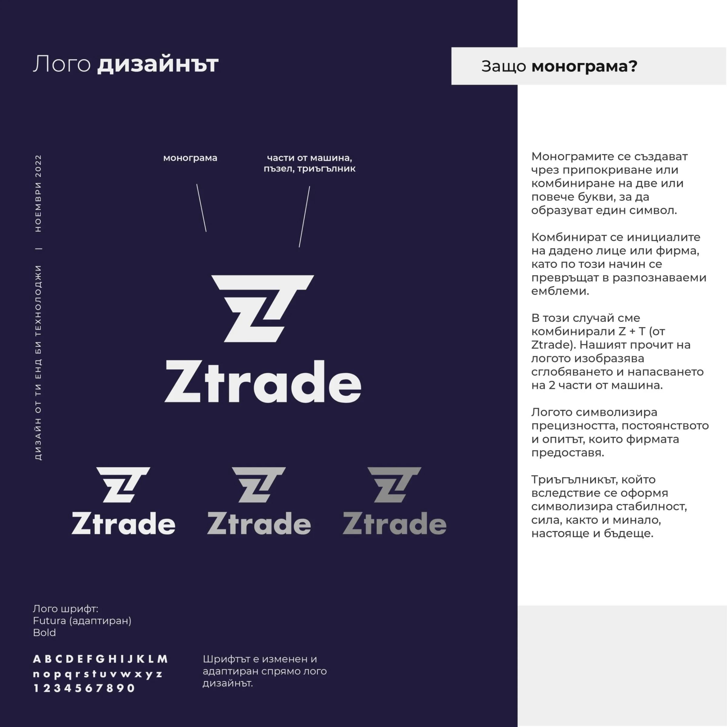
The mark is a monogram of the Z and T in Ztrade. The two letters fit together like two machine parts, and their shared outline forms a triangle. The name is set in Futura Bold, adapted for the logo.
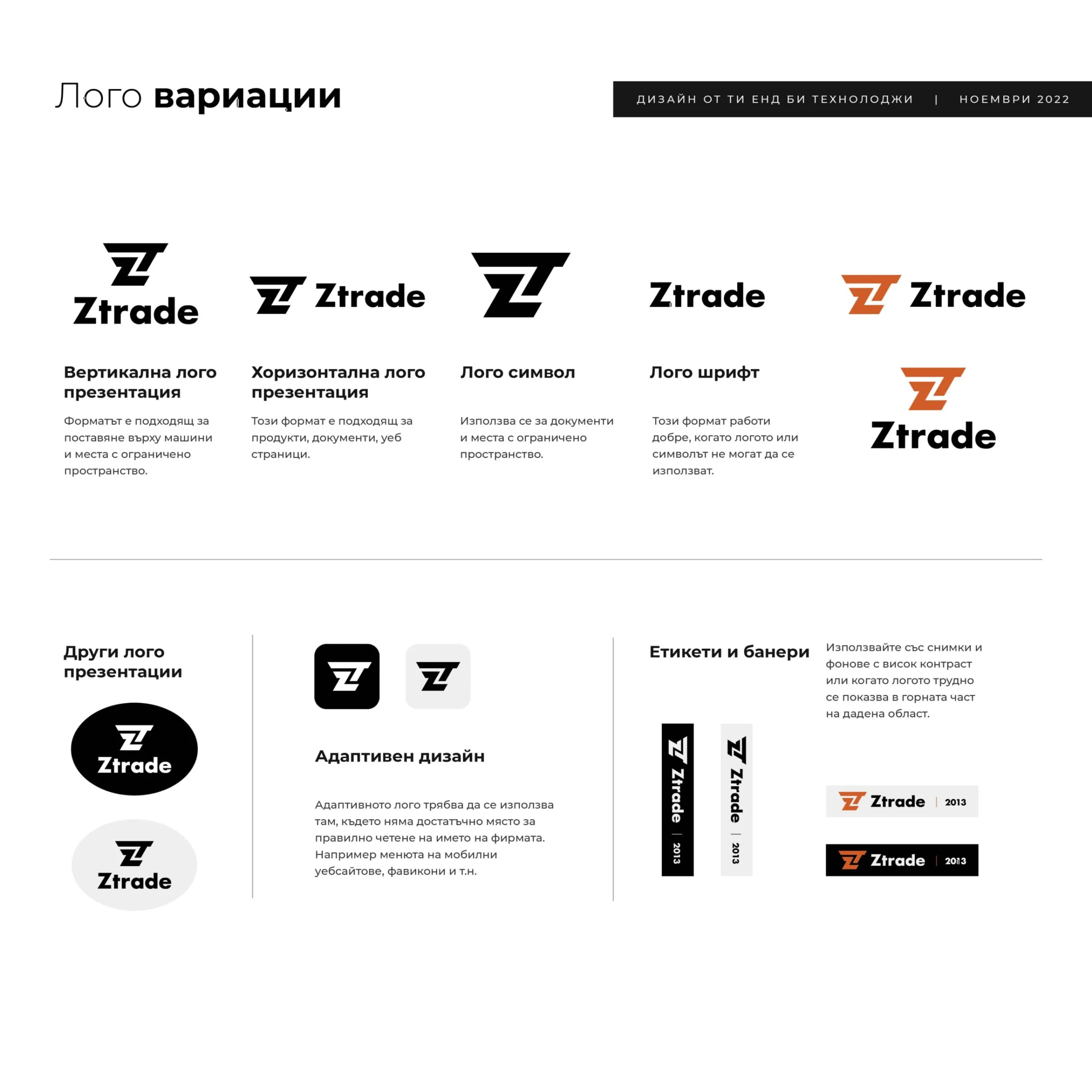
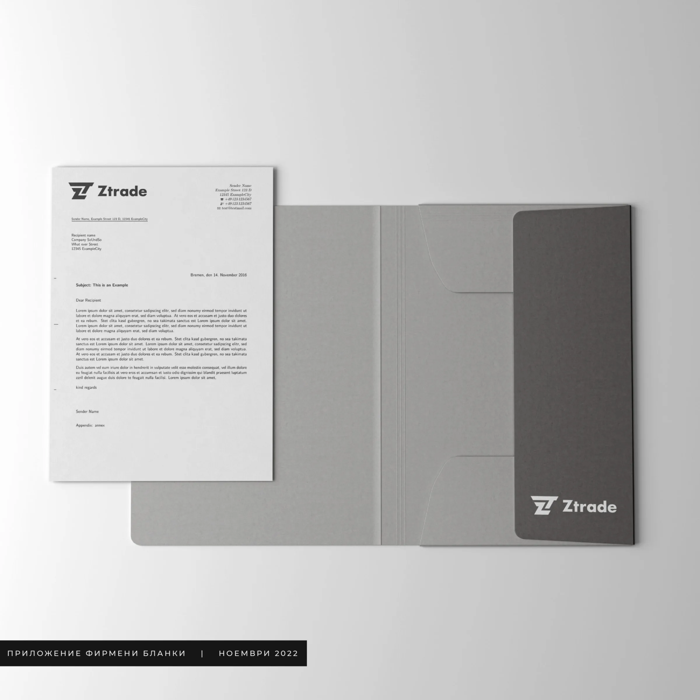
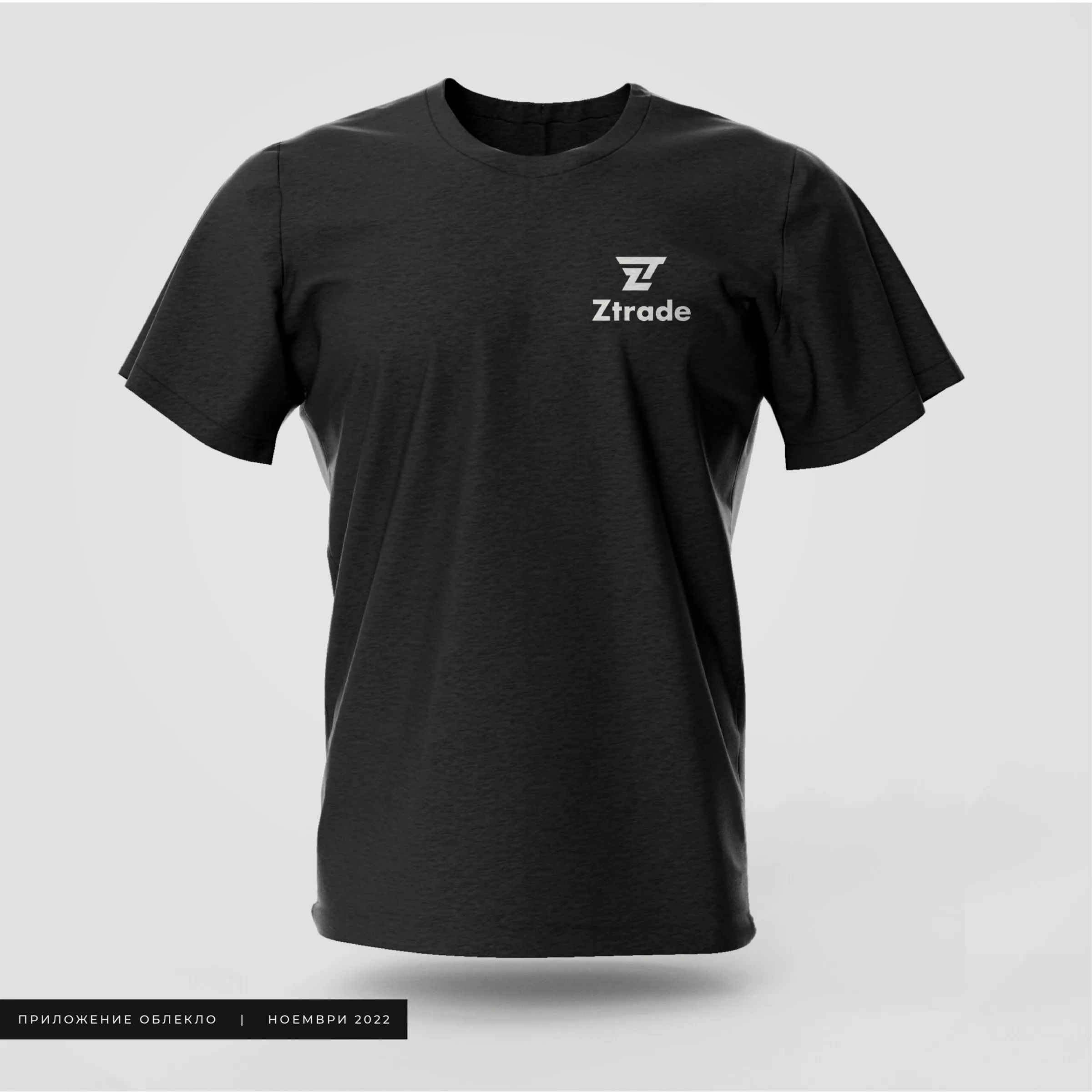
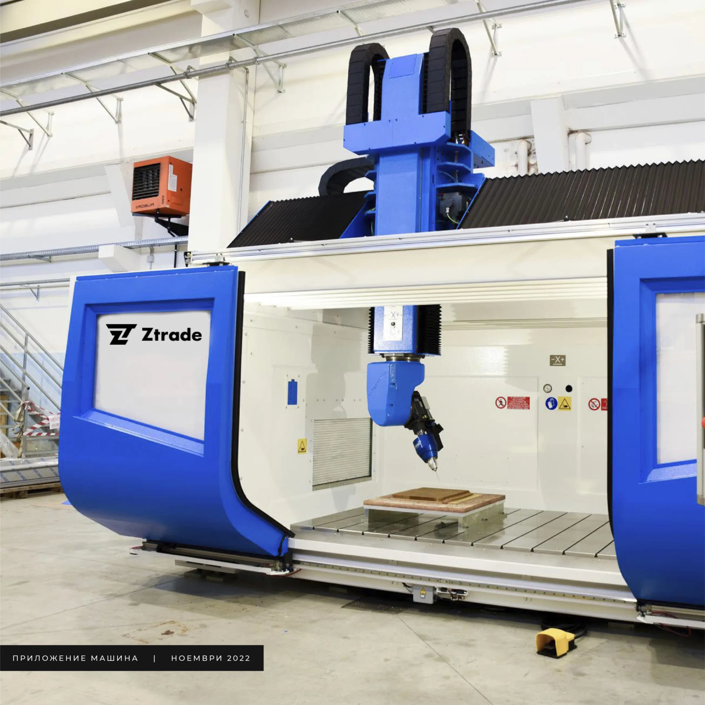
The logo comes in a vertical version for machines and tight spaces, a horizontal one for products, documents and websites, a standalone symbol, a standalone wordmark, an orange variant, an icon for mobile menus and favicons, and versions for labels and banners. The presentation shows it on a letterhead and folder, a T-shirt and a CNC machine.
Gallery
SERVICES


Every project here is the work of our team.
All case studies